BLOOM & STONE
New modernised identity for a creative agency that works to bring about social change in South Africa.
The brief →
My clients, Terri and Vanessa, came to me when they decided that they needed a brand refresh for their agency. The main focus of the work they were doing was changing and they wanted a new identity to reflect that.
They were after something fresh and dynamic, and because they pride themselves on their storytelling abilities, wanted the new brand to support that visually.
The solution →
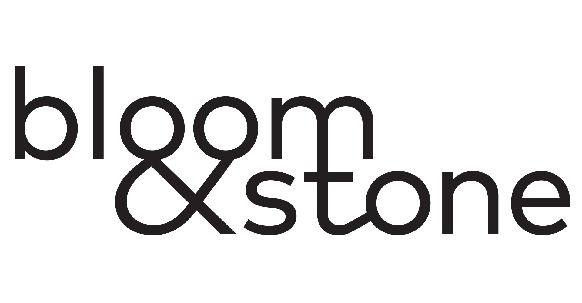
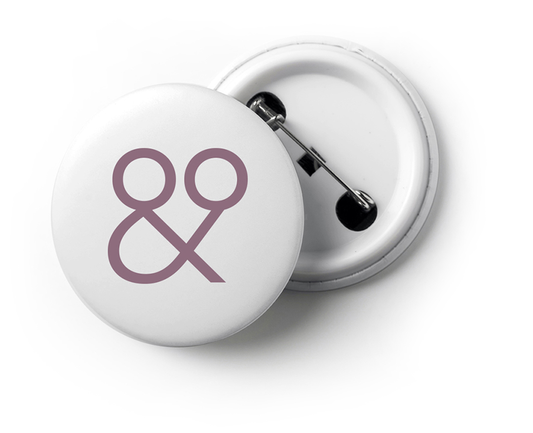
The biggest issue I had with Bloom & Stone’s existing logo was that it focused almost exclusively on the ampersand, with the two names small and inconsequential. I wanted to fluidly link and merge the names together, driving home the strength and cohesiveness of the agency’s partnerships (both internally between the stakeholders and externally with clients).
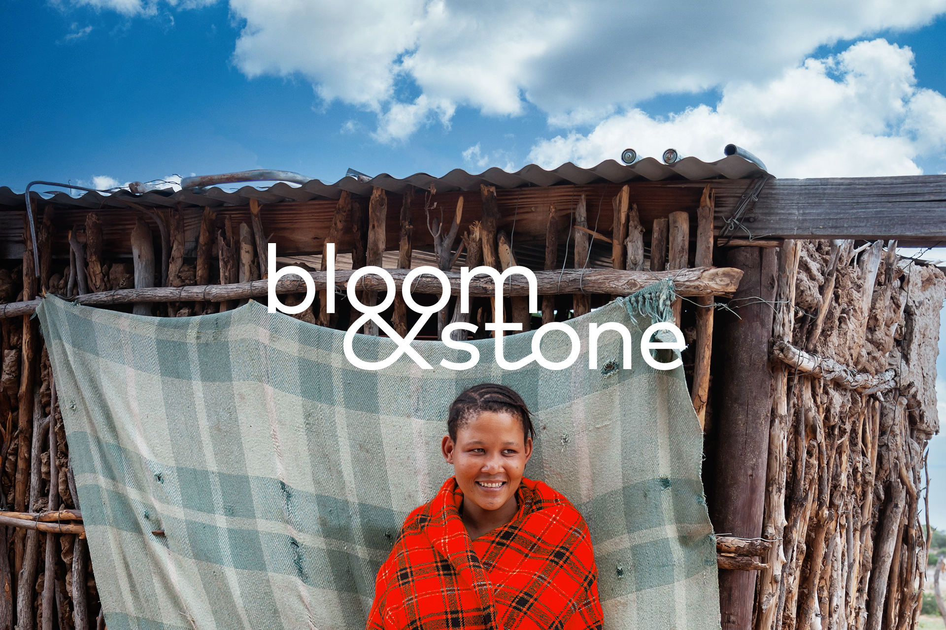
I merged an ampersand shape into the first O of ‘Bloom’ and then merged that with the second O, essentially creating a symbol that hints at the work the agency does in the arena of social change and creates mini stories: two people embracing, a parent holding a child, a pregnant woman, a man holding up an object for scrutiny, a map etc.
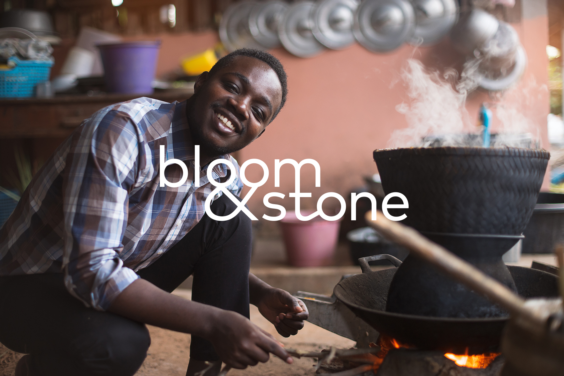
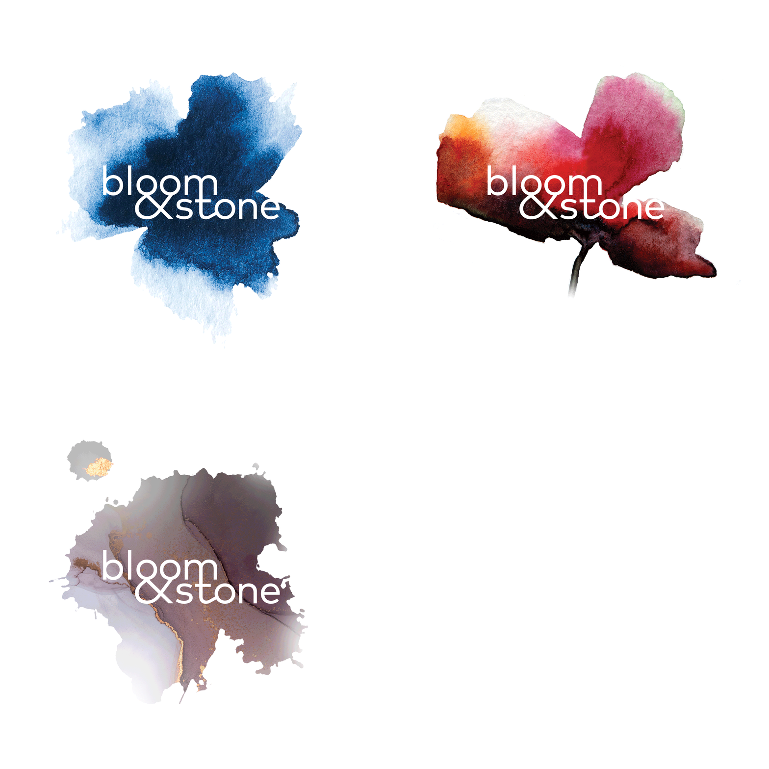
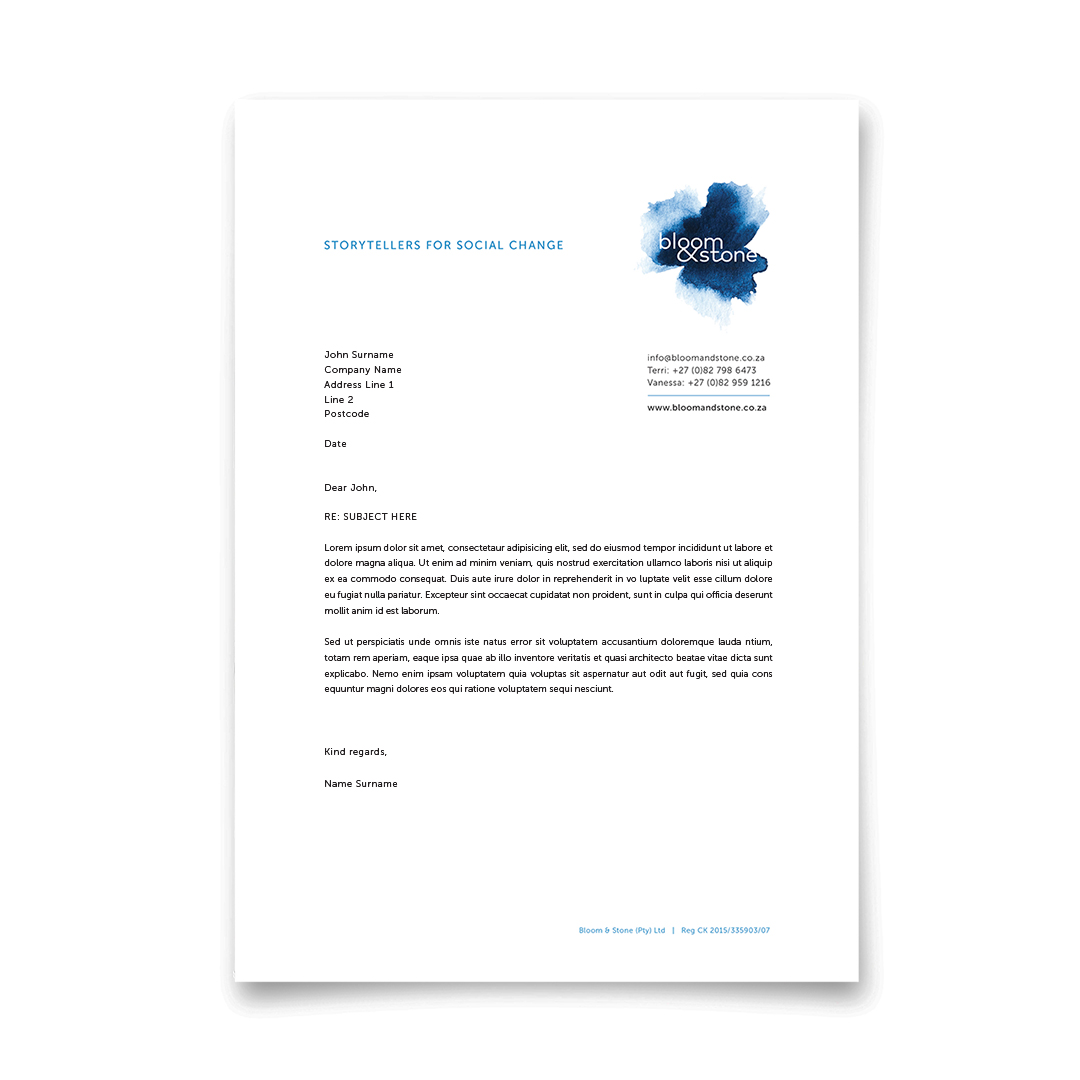
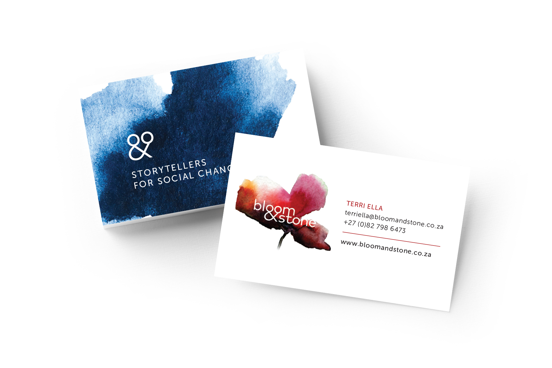
As part of the broader corporate identity, the new logo either stands alone or sits within various hand-painted shapes that reflect the name. These shapes add colour, texture and softness when required.
Collaborating with Russ on our new corporate identity was a total pleasure – his thoughtful approach, interpretation of the brief and masterful creativity translated into the perfect evolution for our blooming brand!
NEXT PROJECT
↓
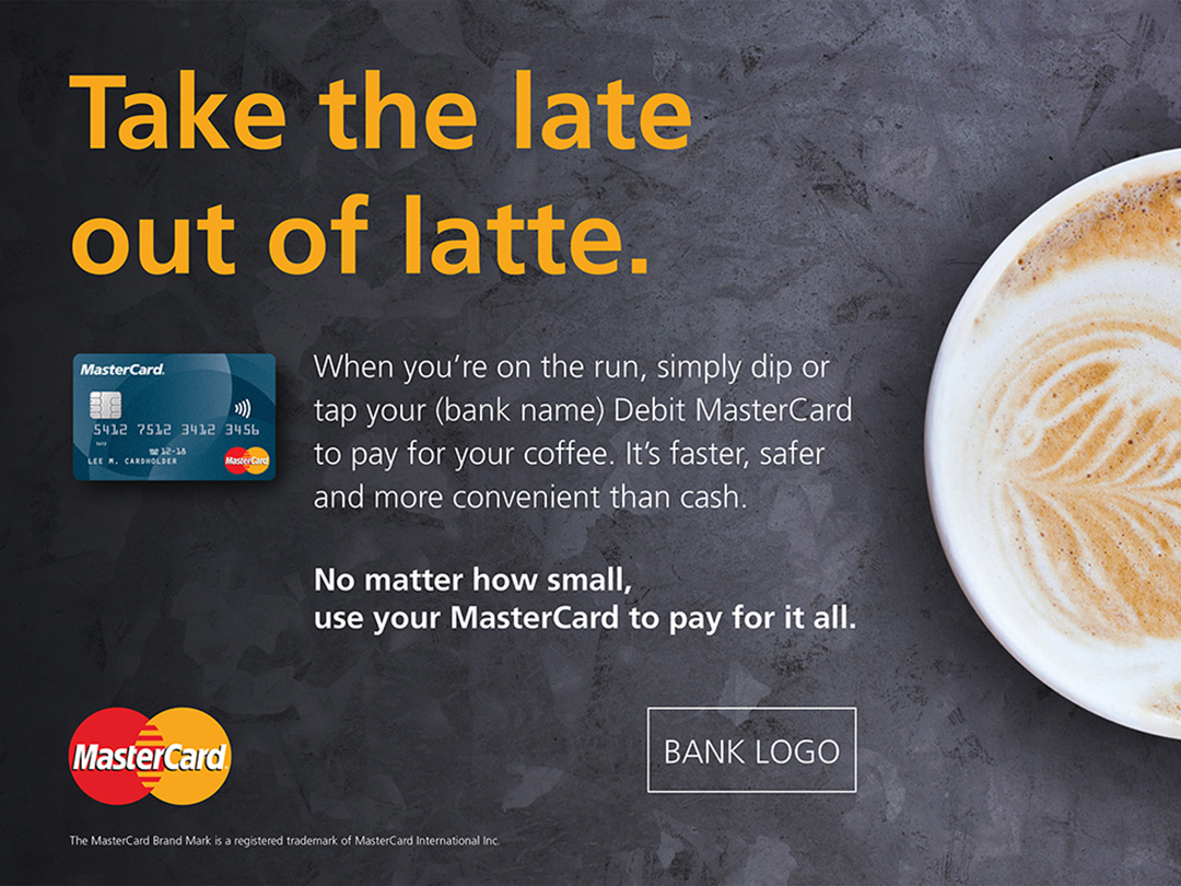
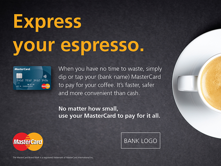
MASTERCARD EVERYDAY
A campaign created in conjunction with MasterCard USA to drive card purchases of small everyday items.
VIEW >


MASTERCARD EVERYDAY
A campaign created in conjunction with MasterCard USA to drive card purchases of small everyday items.
VIEW >
