JJUST MOVE
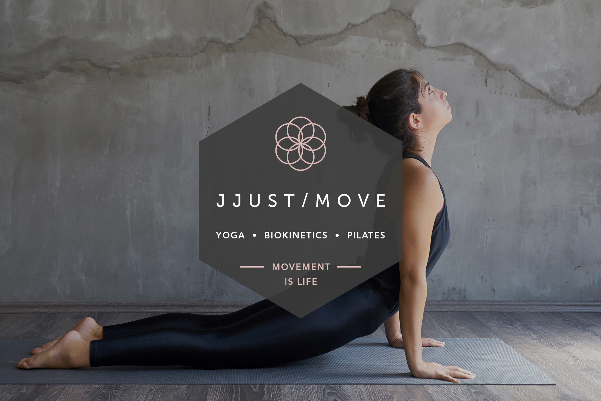
Logo design, stationery and website creation for an urban pilates, yoga and biokinetics studio in Johannesburg.
The brief →
I was chuffed when Justine Johnson approached me to design the identity for her new movement studio. I love to be involved from the very beginning of a brand’s life and to help establish its personality for the world to interact with.
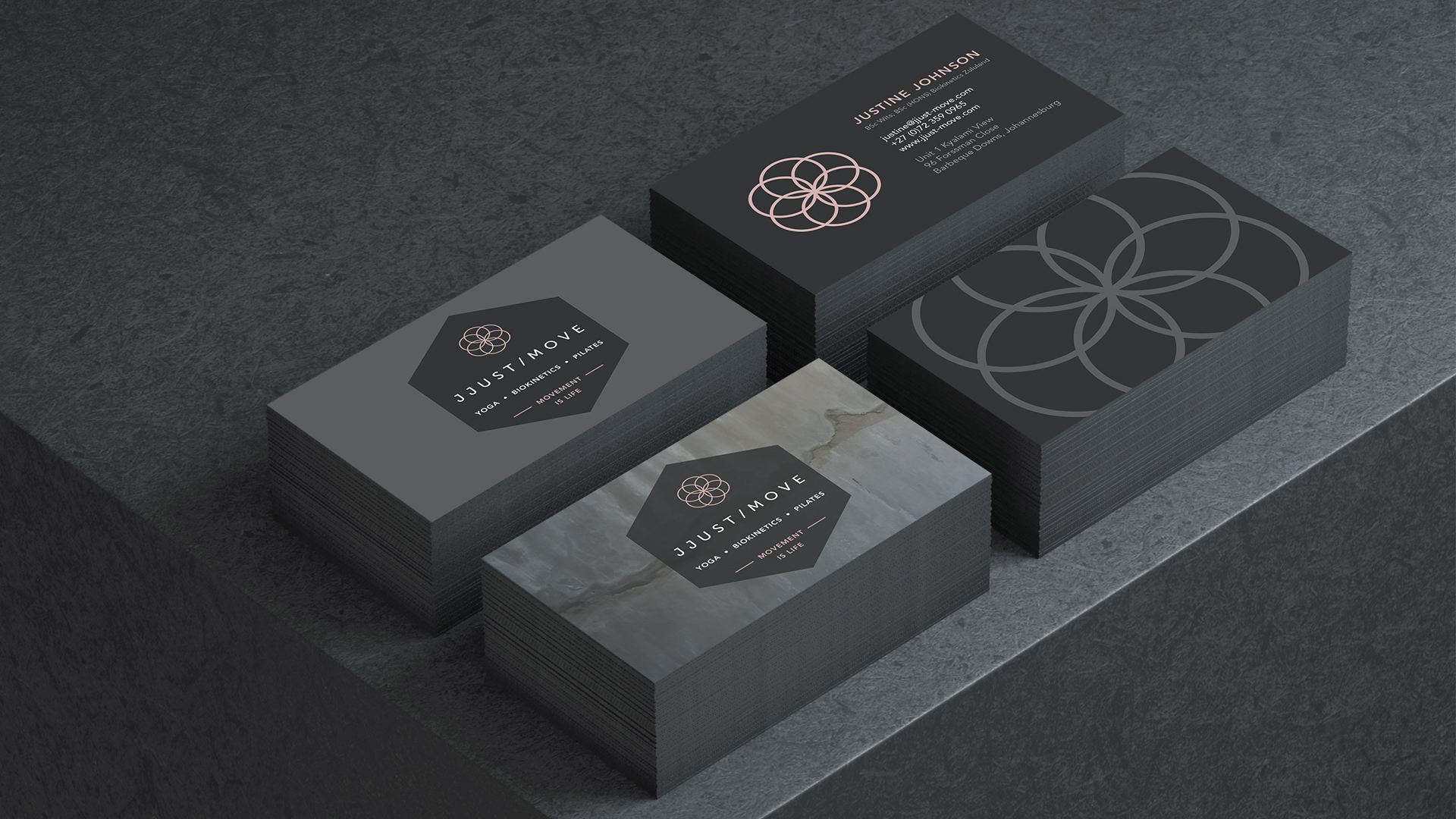
Justine already had the name JJust Move, but she needed a logo, signage, newsletter templates, stationery items and a cohesive digital presence to bring her brand to life.
The solution →
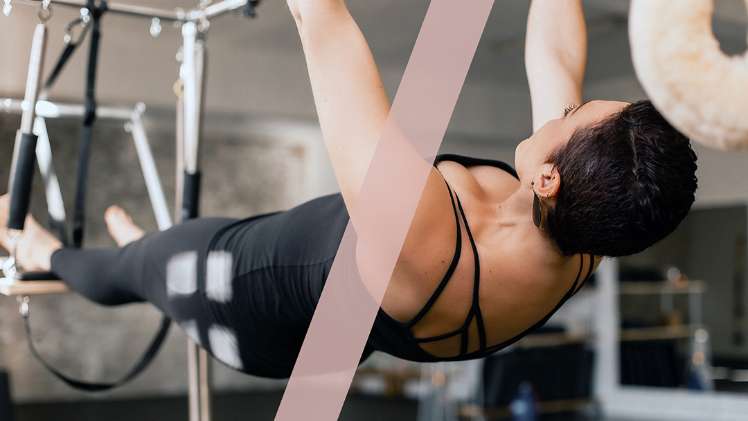
Justine is passionate and committed, and believes that hard work yields results. So after seeing her new studio space (brick walls, concrete floors, loft-style windows), I knew the route I needed to take had to be more urban-sweat than nature-glow.
For the logo, I wanted to stay away from the symbols and softer colours normally associated with pilates and yoga studios: ribbon-like figures caught in midair, abstract forms meditating, leaves, greens and pale blues.
Instead, I played around with bold geometric shapes and diagonal lines. Dark grey is the predominant colour, with pops of dusky pink to soften the overall feel.
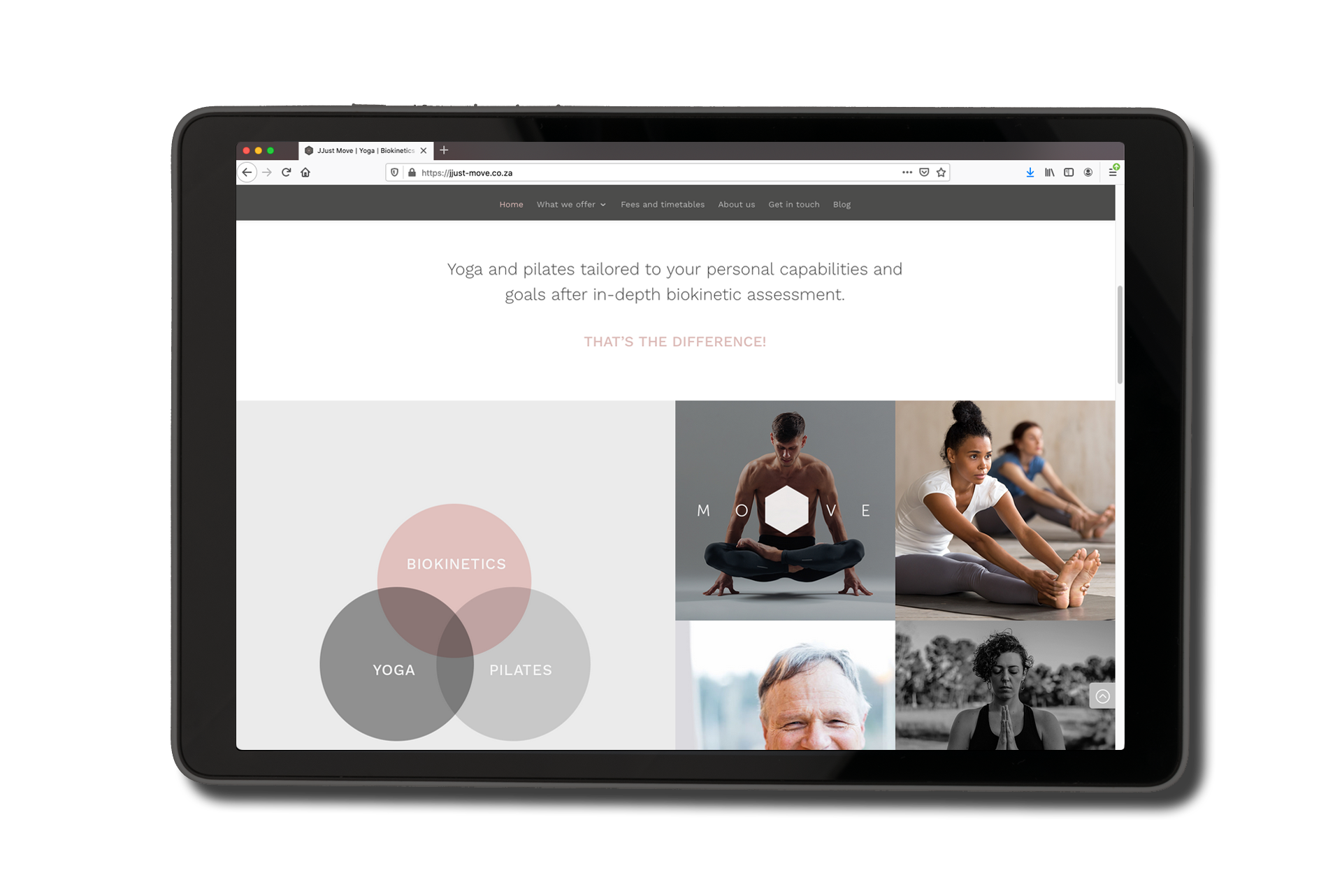
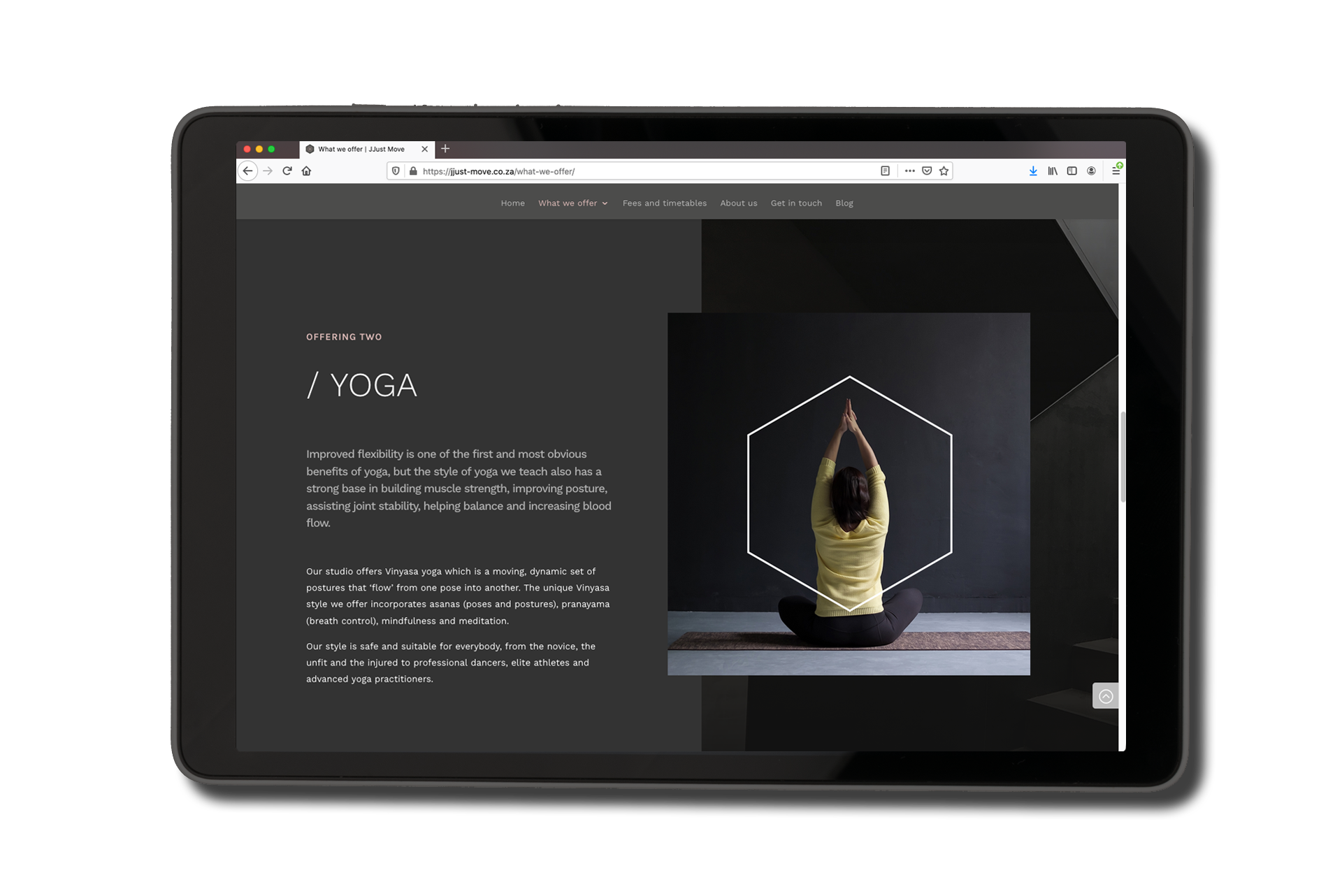
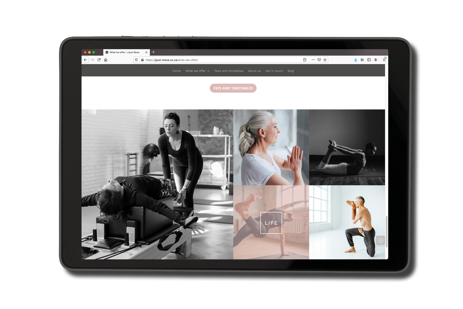
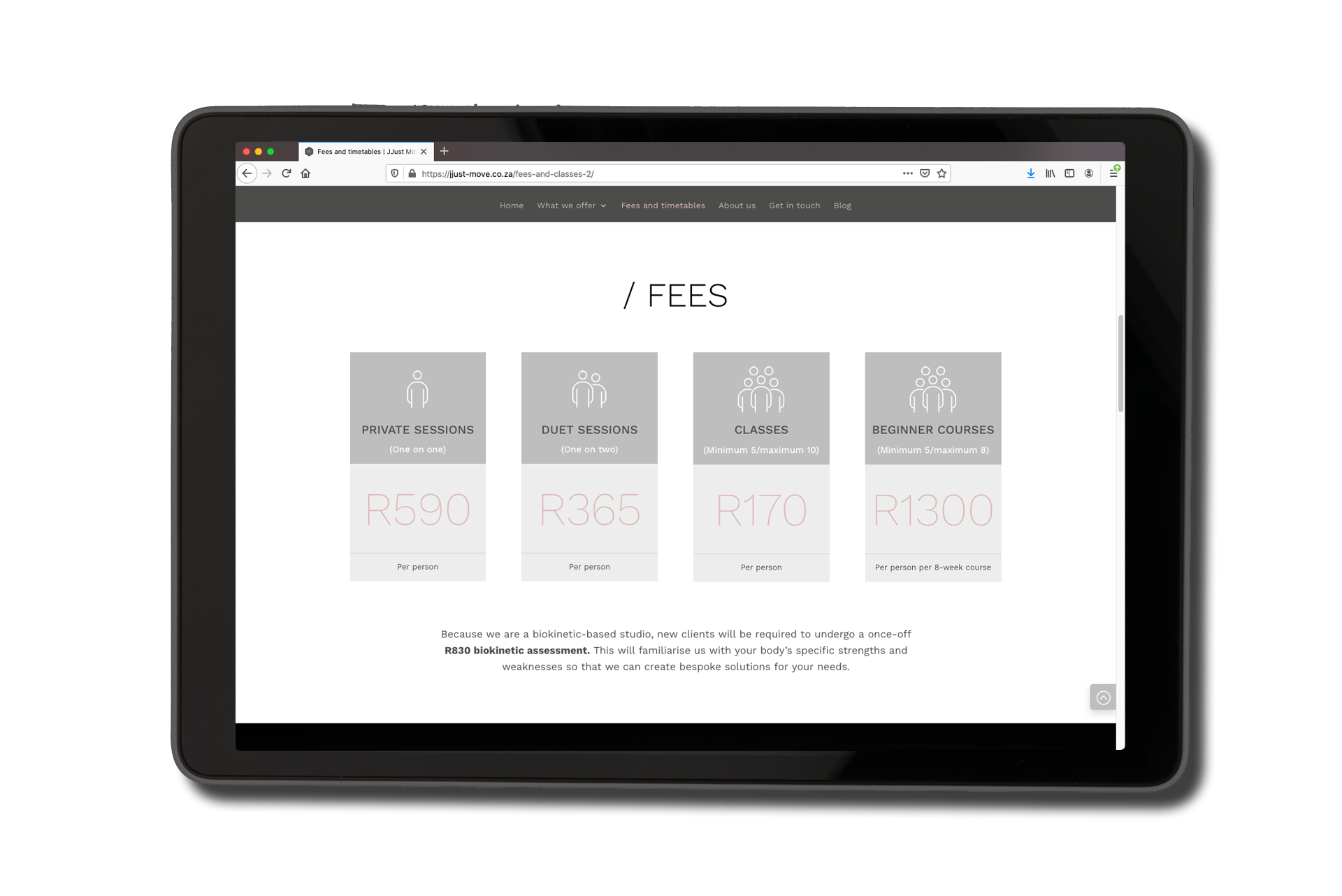

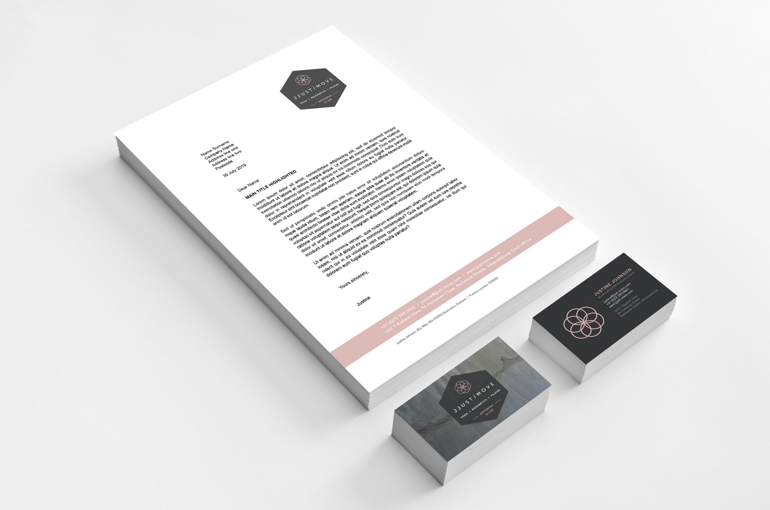
The logo’s symbol stands for many things: circles traditionally represent Mother Earth and a space that is sacred, so I used them to subtly introduce the esoteric side of the business. The circles form an abstract flower, hinting at nature, but not in an obvious way. The movement of the circles is contained, mirroring the movements in pilates, yoga and biokinetics where body parts move around static points during each exercise.
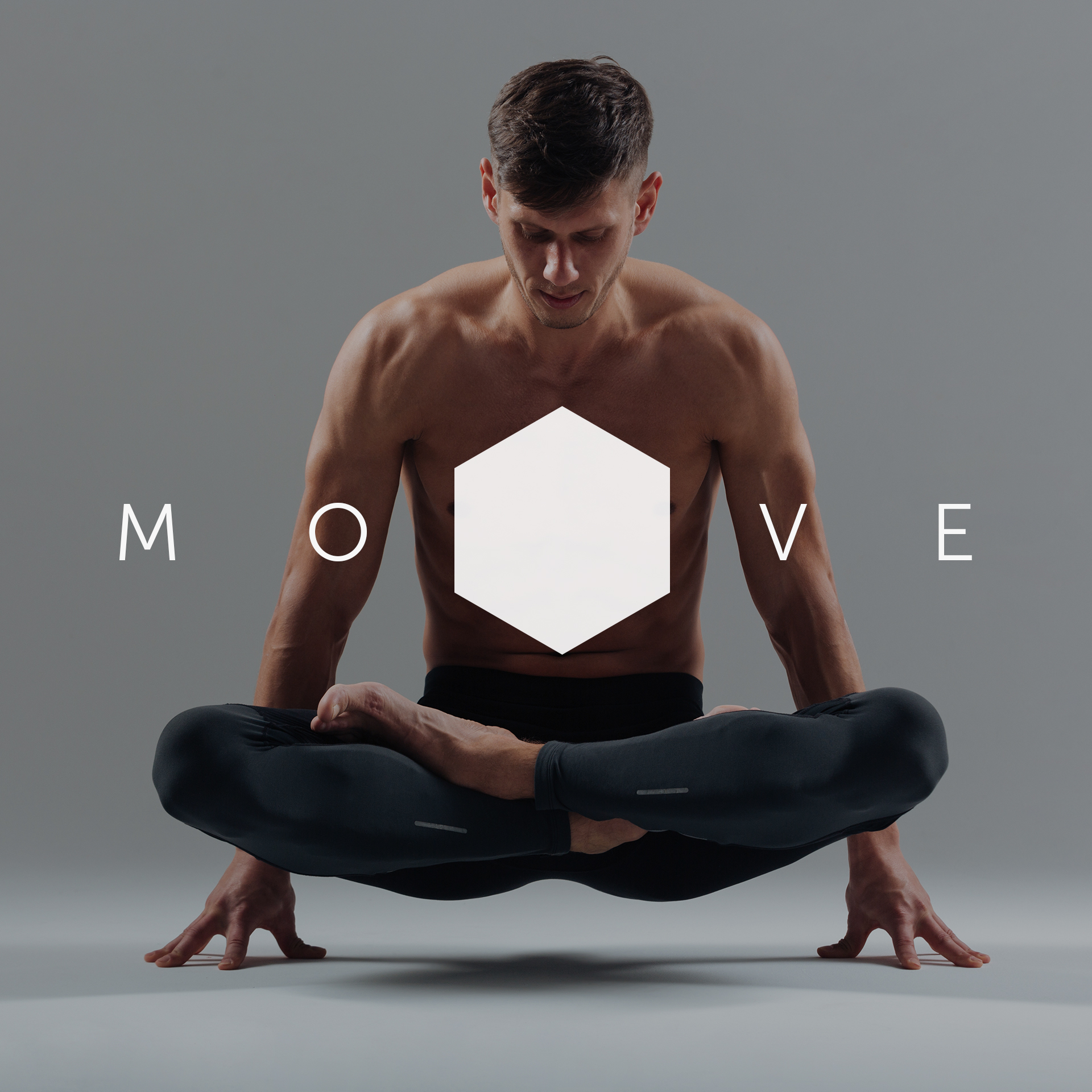
The full logo is contained within a hexagonal holding shape, but the pink symbol and the name can be used separately too when required.
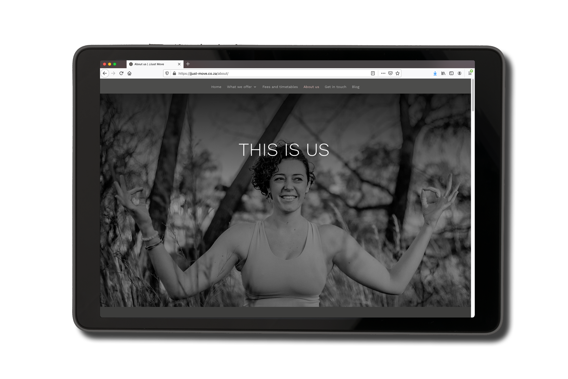
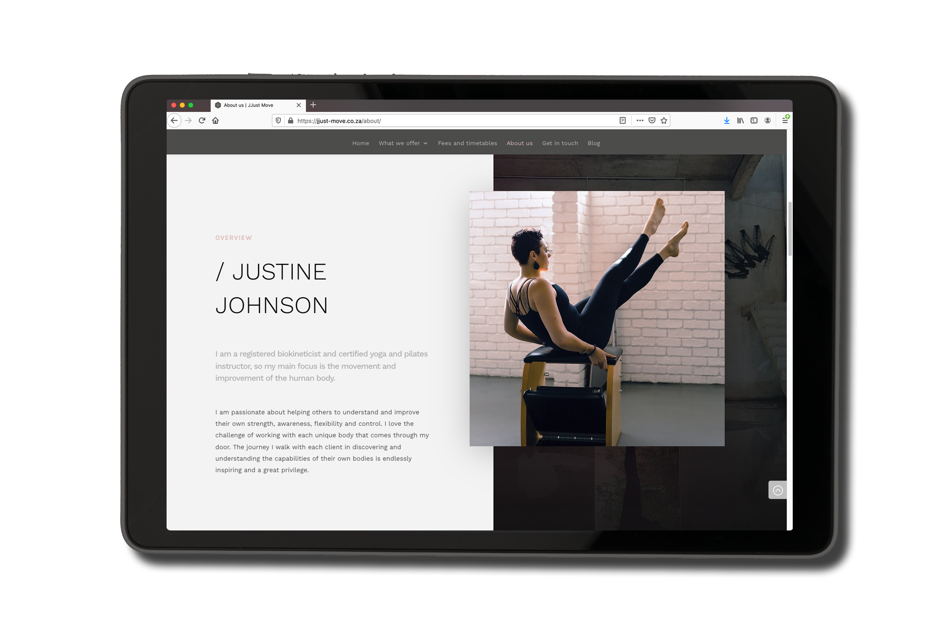
The website has a bold, industrial feel, but is also warm and welcoming. It suits Justine’s personality and vision perfectly: You know that each time you visit the studio you’ll be welcomed with a smile and love every minute of your session. But you’ll be working your ass off while doing it.
Check out the website here.
Russ’s work is of the highest quality and standard. He designed exactly the kind of logo and site I was looking for after just a few conversations. I highly recommend him and his work.
NEXT PROJECT
↓
MASTERCARD VIDEO PLAYBOOK
Two guides and a toolkit enabling effective creation of global product marketing videos within brand parameters.
VIEW >


MASTERCARD VIDEO GUIDELINES
Two guides and a toolkit enabling effective creation of global product marketing videos within brand parameters.
VIEW >
