MILL FALLS
Sleek, eye-catching identity and advertising for a new craft rum brand.
The brief →
I was thrilled to be asked to conceptualise the brand look and feel for a new alcohol range consisting of a light and dark rum, plus to work on advertising and social media concepts.
The brief →
I was thrilled to be asked to conceptualise the brand look and feel for a new alcohol range consisting of a light and dark rum, plus to work on advertising and social media concepts.
The solution →
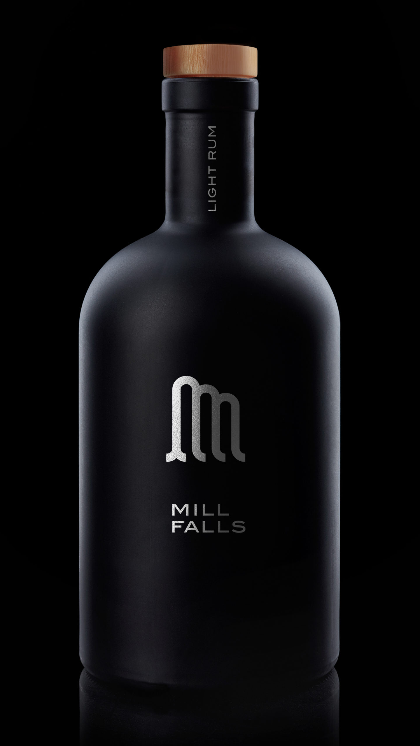
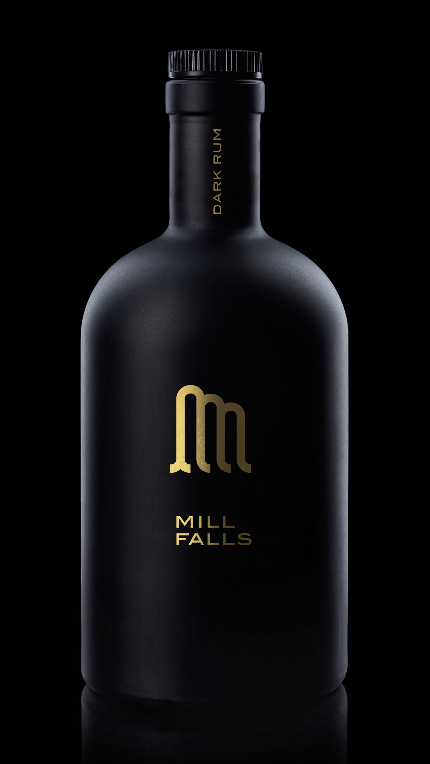
When I began designing, I used the bottles as a starting point. My preferred choice from the get-go was to use dark and opaque matt bottles. They conjure up images of 17th Century tall ships, stormy harbours, straw-lined crates, lantern-lit pubs and dark thatched cottages in the English countryside.
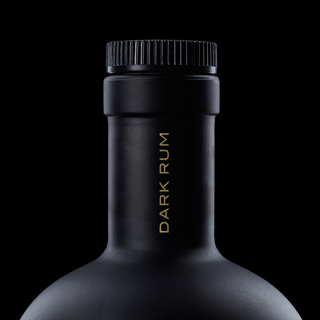
I decided to stay away from adhesive labels, and to print directly onto the bottles instead: metallic silver for the light rum and gold for the dark. The effect against the black matt bottle is dramatic and striking, and eye-catching in a busy retail environment.
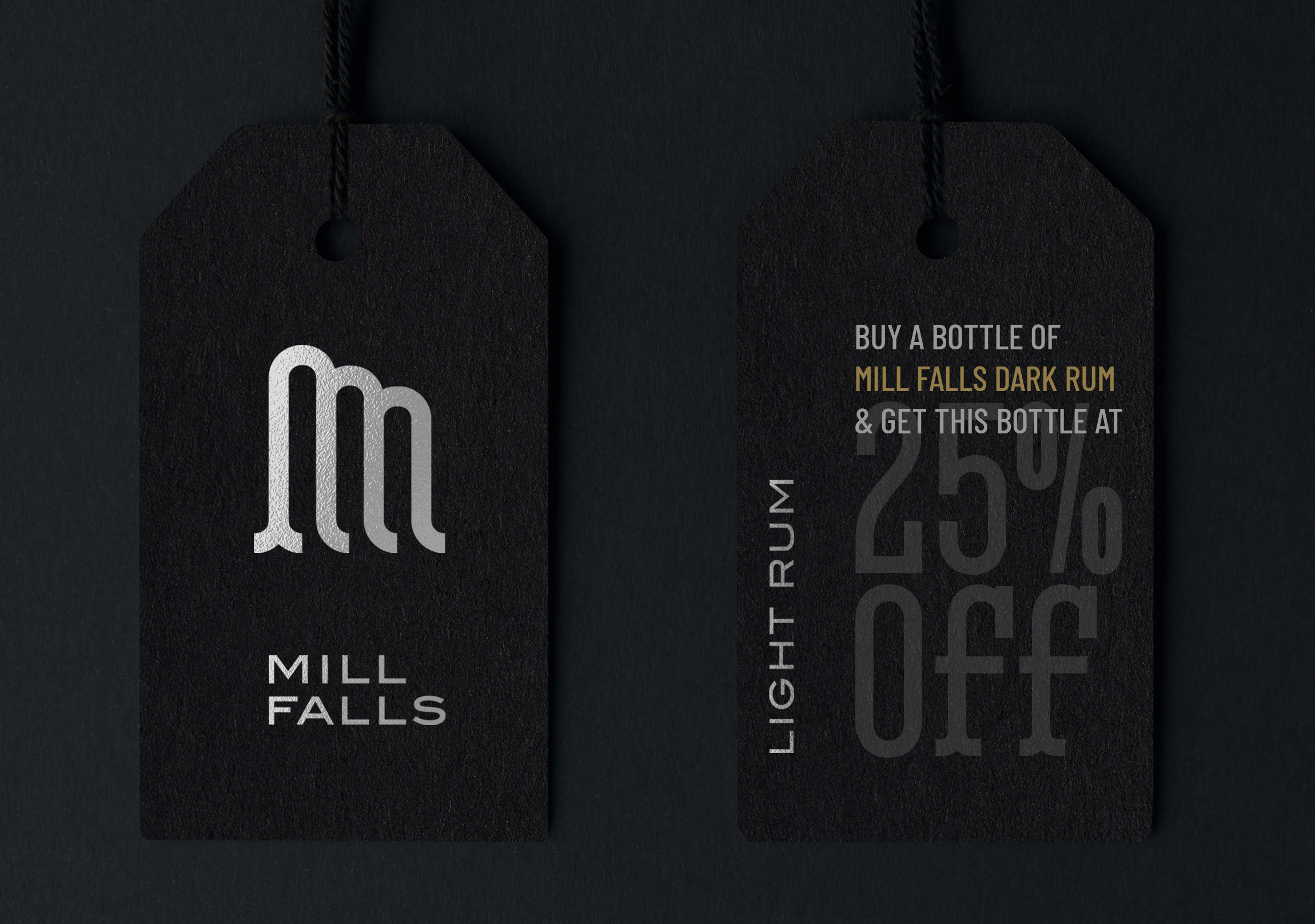
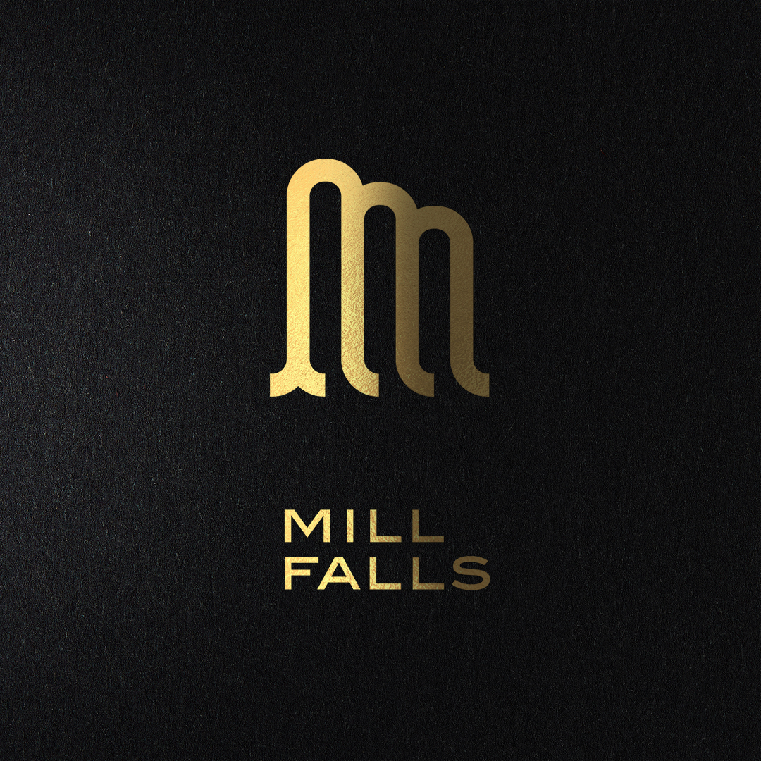
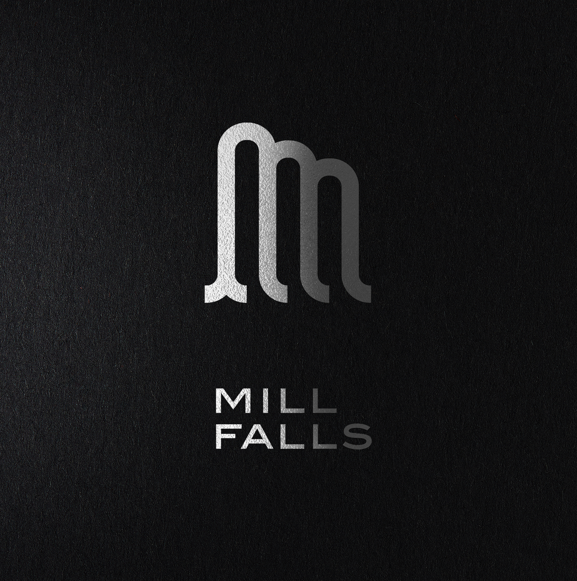
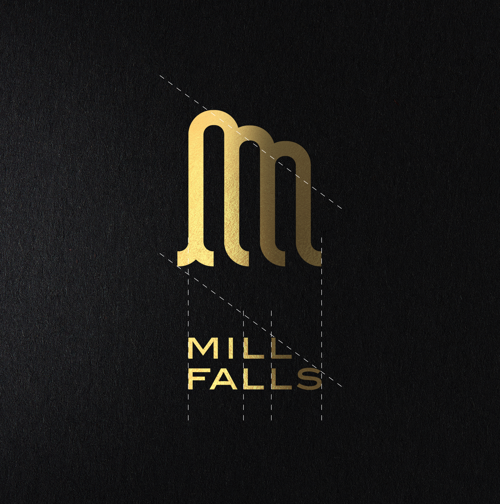
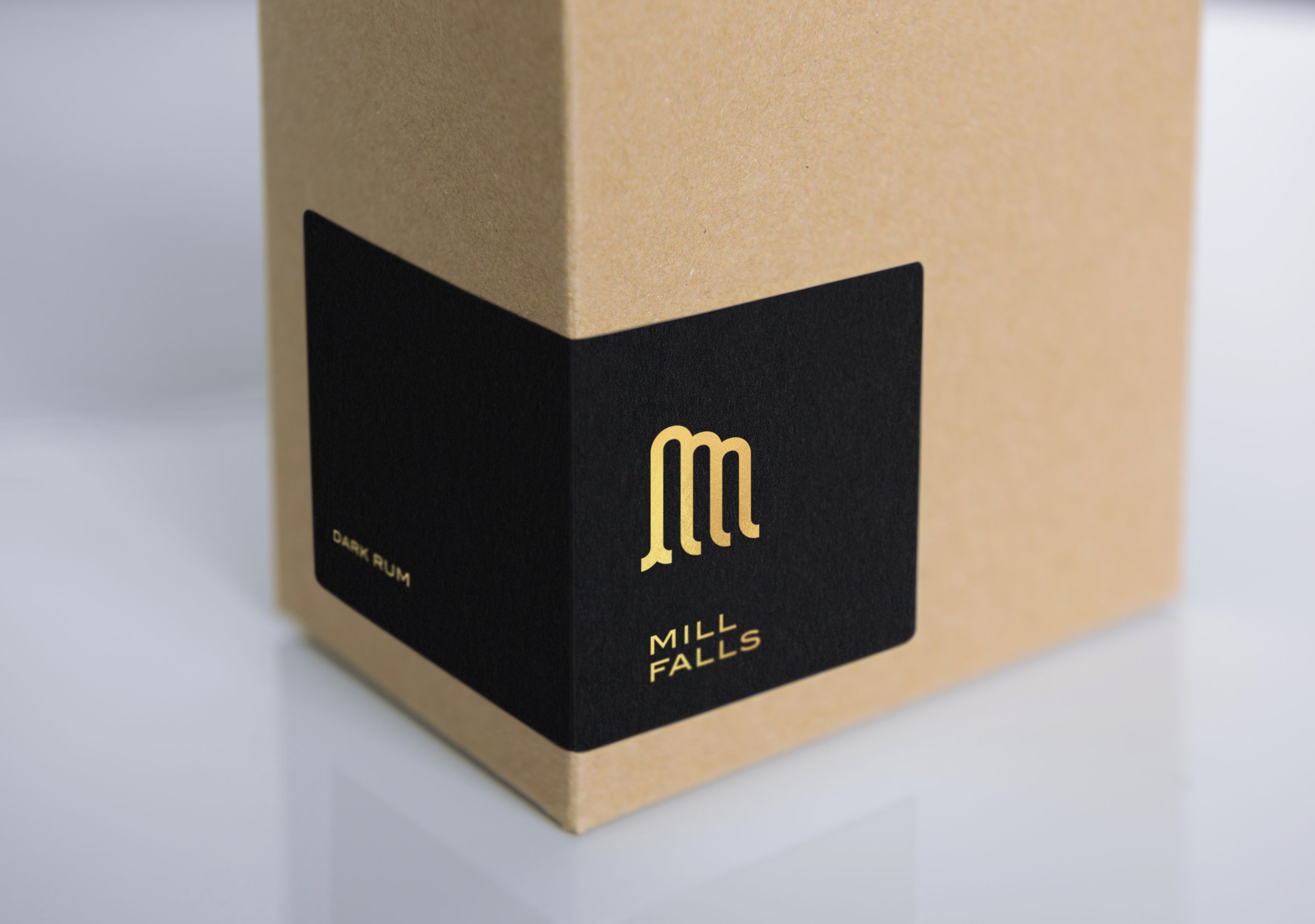
To contrast with the bottle, I wanted a more contemporary logo design, so I chose a dynamic, sans-serif font. I then designed a symbol which is both concurrently the letter M and a stylised representation of a waterfall.
By left-aligning the name, I managed to line up the four Ls and at the same time create an invisible diagonal line in the top right-hand corner of the name block which emulates the diagonal trajectory in the symbol.
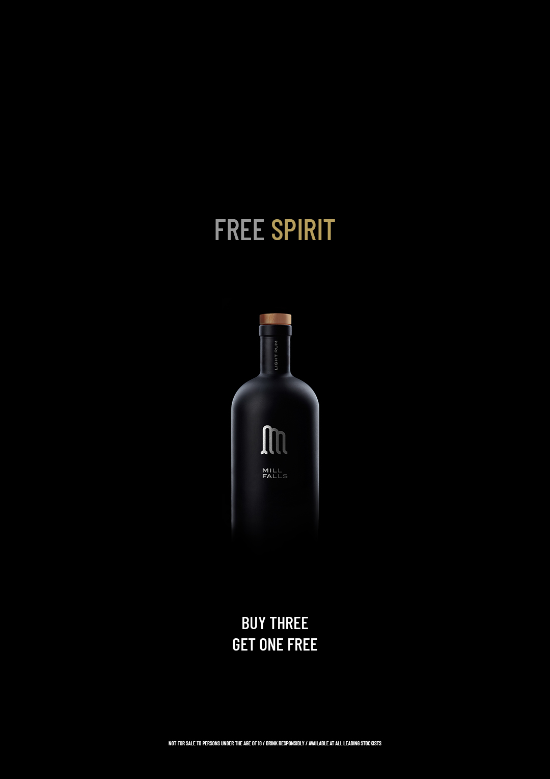
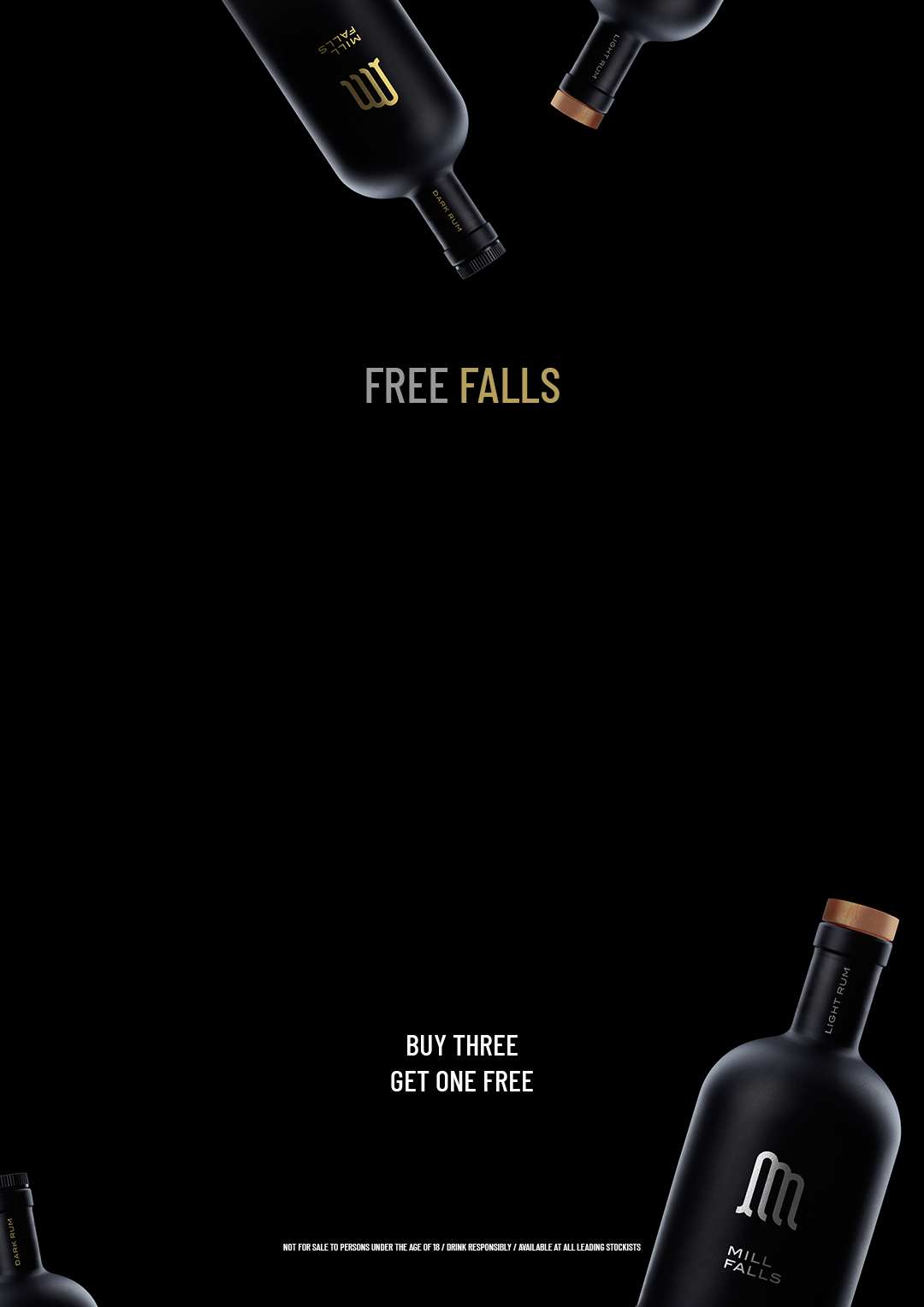
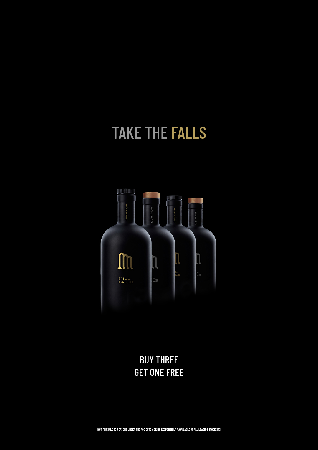
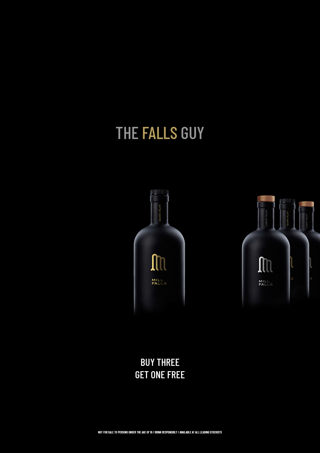
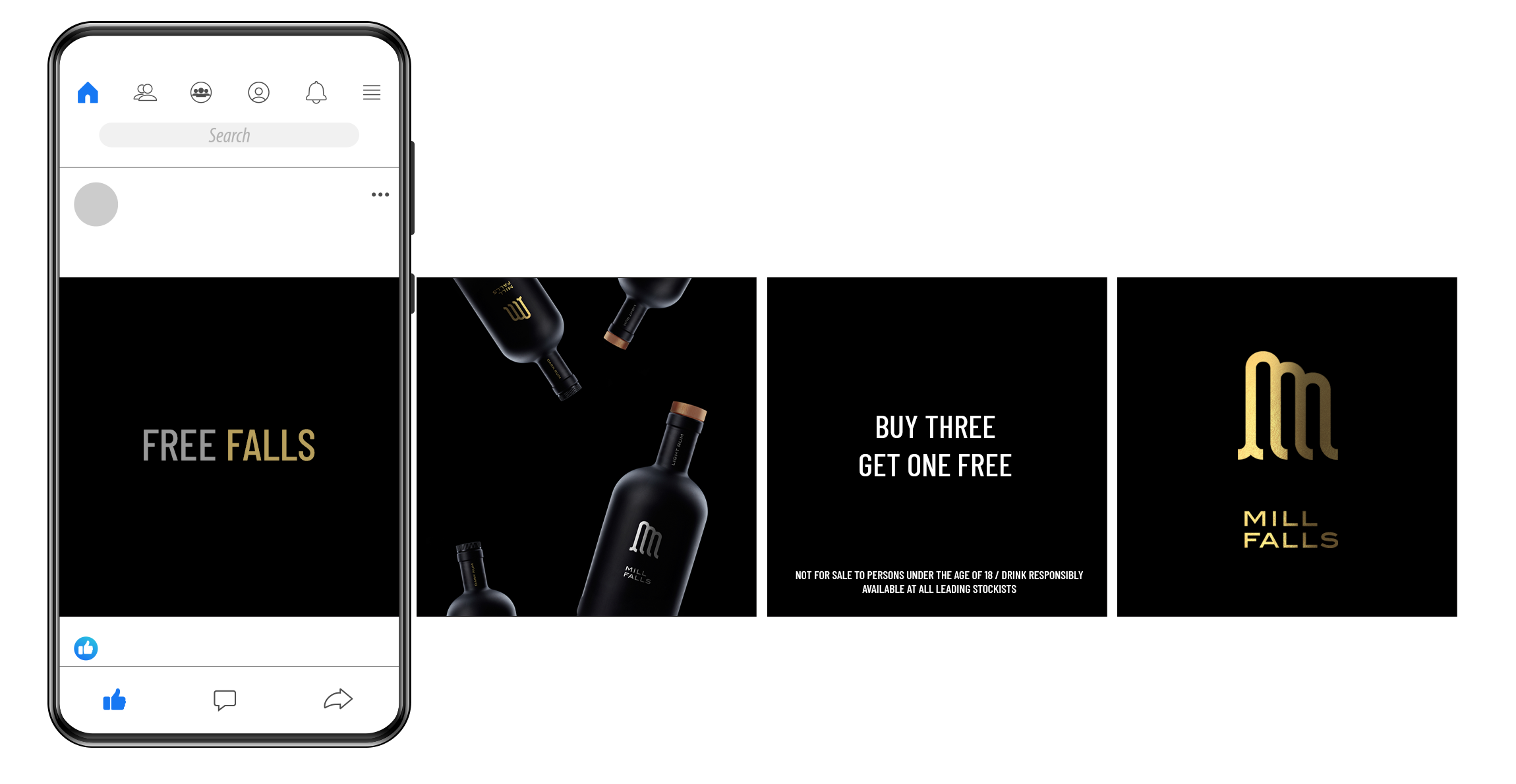
Advertising needed to keep the same dark and sleek look. The first campaign was focused on receiving a free bottle of Mill Falls upon the purchase of three others: a full case of four at 25% off basically. I created very simple copy, playing around with the word ‘Falls’ and using the positioning of bottles to drive the messages home.
NEXT PROJECT
↓

ELEPHANT HOUSE
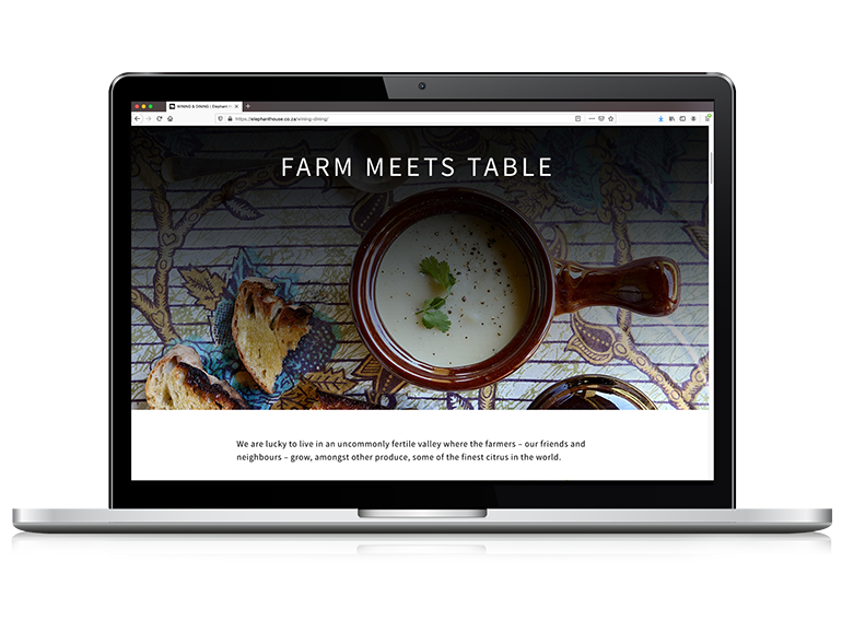
New evocative website for a luxury guest lodge servicing South Africa’s Addo Elephant Park.
VIEW >


ELEPHANT HOUSE
New evocative website for a luxury guest lodge servicing South Africa’s Addo Elephant Park.
VIEW >
