ROBYN DE KOCK ATTORNEYS
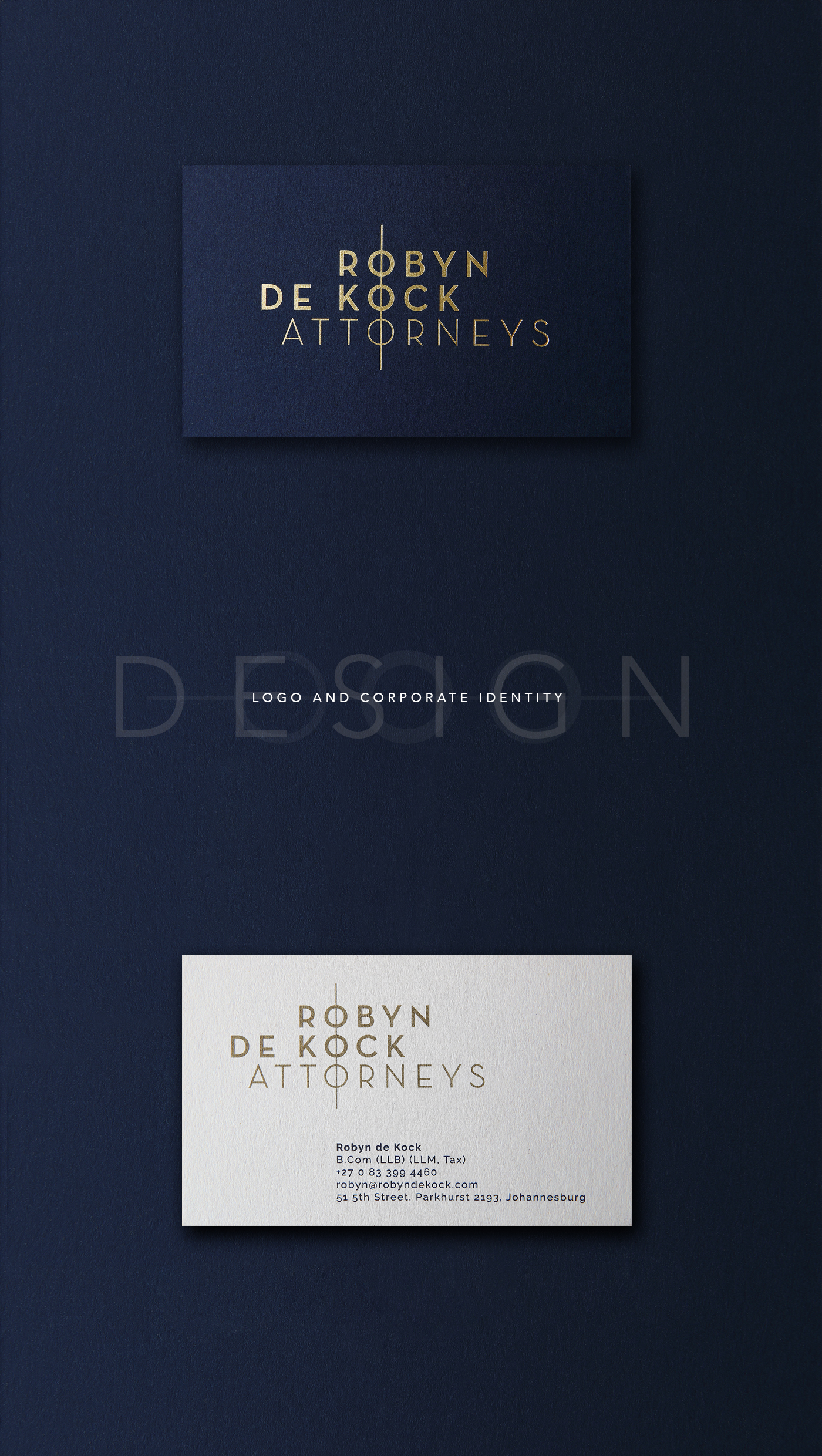
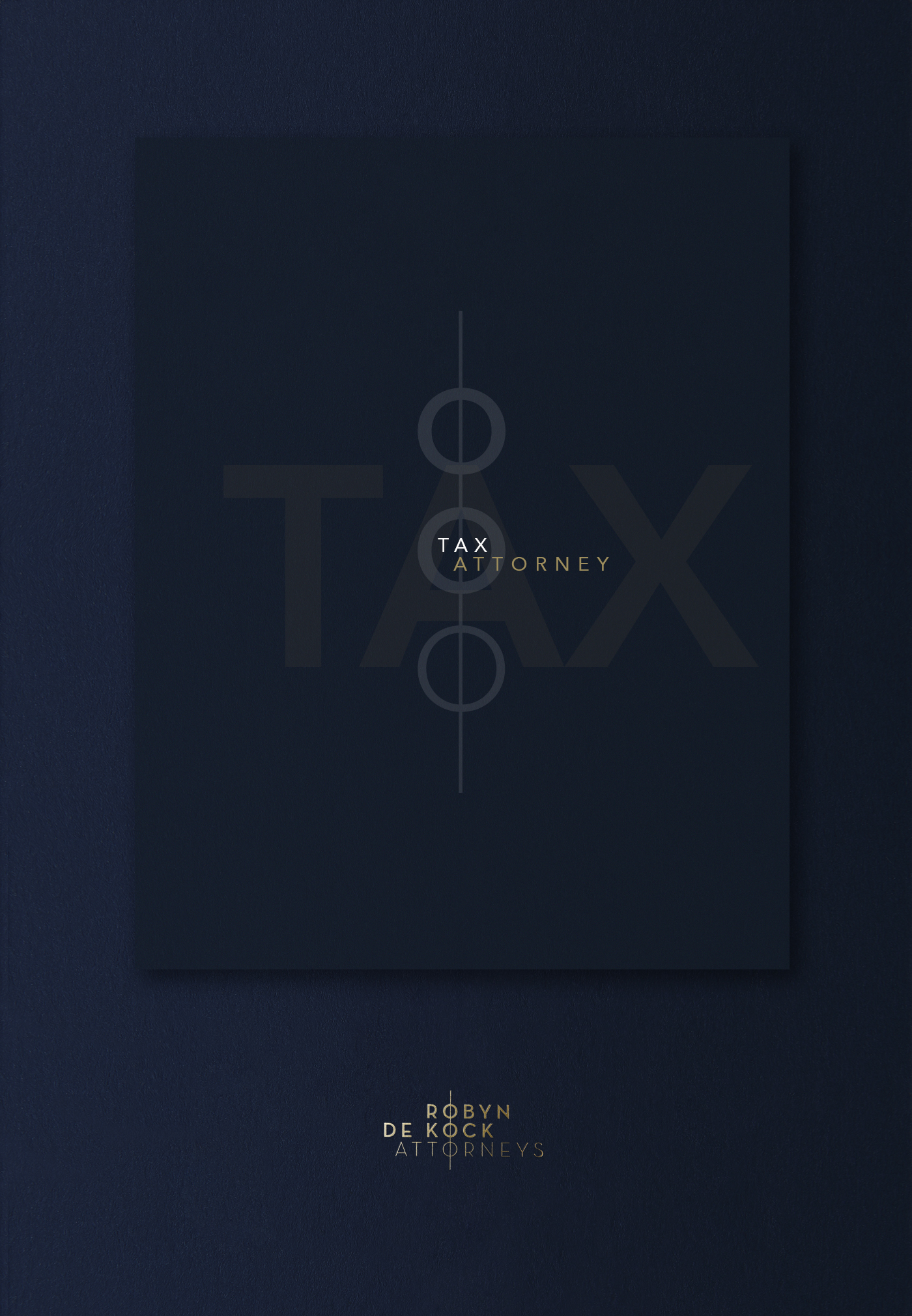
Sophisticated logo and stationery design for a new law firm specialising in corporate and international tax.
The brief →
When Robyn de Kock started a new law firm she needed a corporate identity that would suit her personality, but that would also appeal to the high-net-worth individuals and international banks that make up her client base.
She wanted to stay away from clichéd legal symbols and tired logo icons hinting at wealth and status. But she still wanted her brand to look up-market and sophisticated at first glance, and would look right at home in boardrooms from Cape Town to Copenhagen.
The solution →
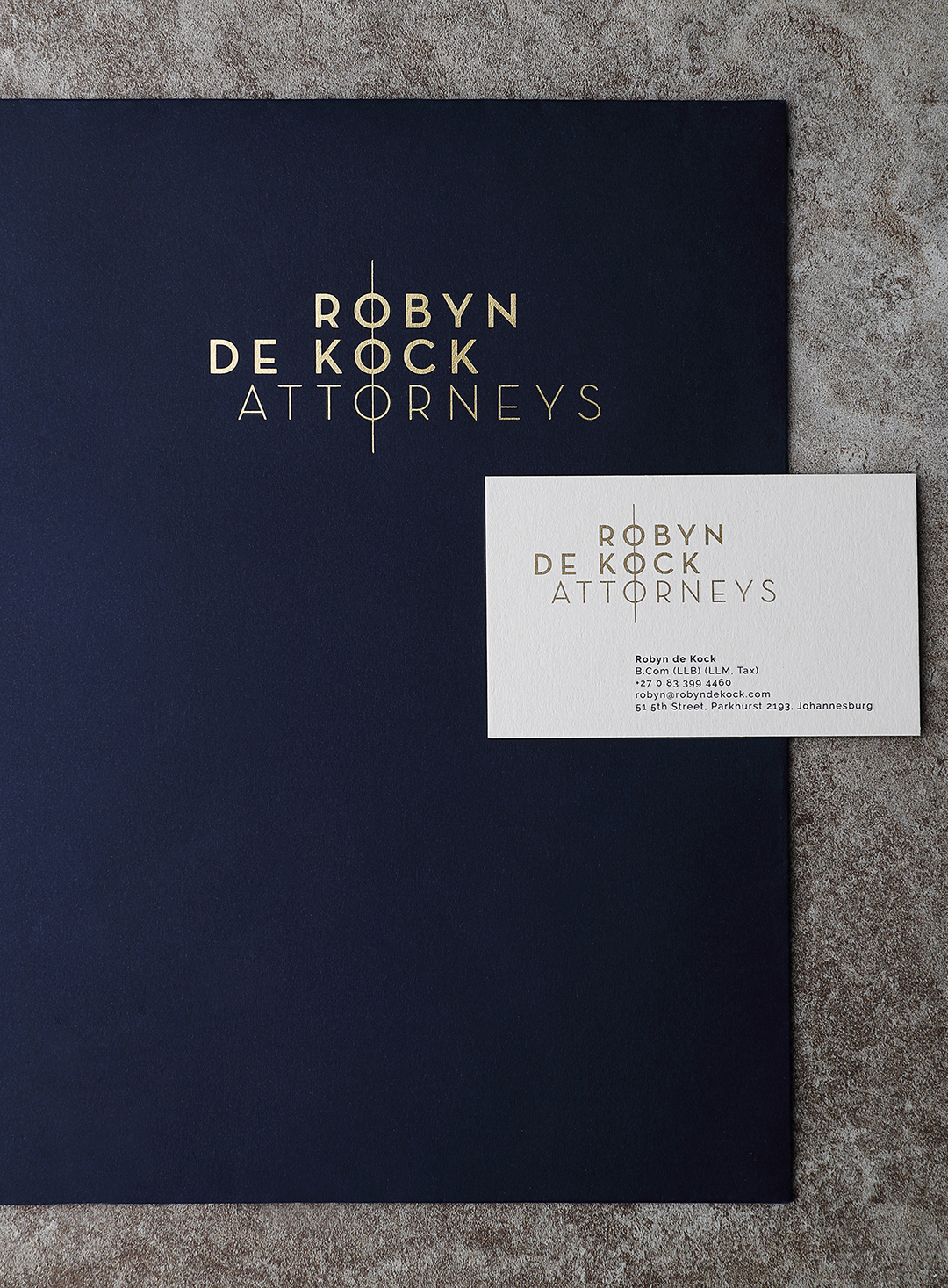
Creating the logo was the first step. Although the final logo is in reality a wordmark, by lining up the three Os and putting a line through them, I essentially created a subtle, hidden symbol. Which can be – and is – used on its own in certain situations.
The symbol is suggestive of various things, all leading back to the tax focus of the business: an abstract abacus, columns of numbers all lining up, and establishing order within disorder.
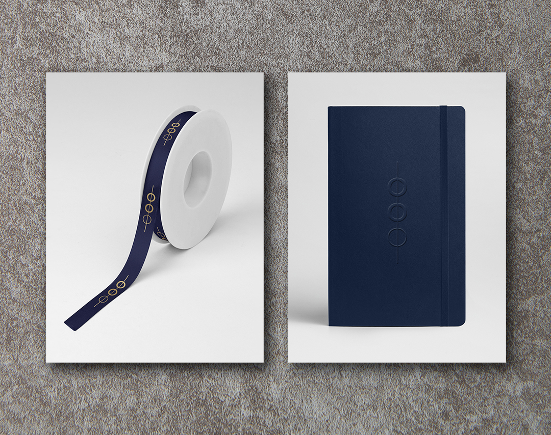

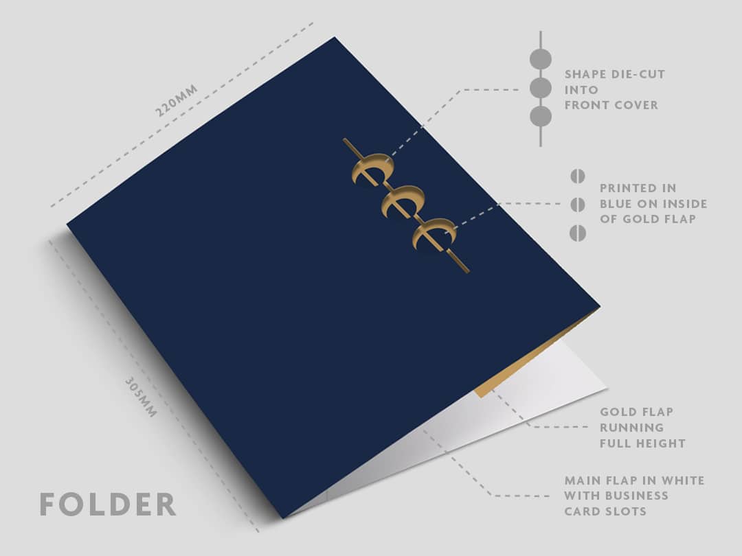
To achieve the premium look Robyn was after, metallic ink, foiling and textured papers were used across the range of stationery: letterheads, comp slips, business cards, envelopes, notepads, ribbons and company profiles.
The result is a brand that is unique, polished and timeless.
NEXT PROJECT
↓


SONY MOBILE INTERIORS AND ACTIVATIONS
Designing store interiors, launch materials and interactive activation stands.
VIEW >

SONY MOBILE INTERIORS AND ACTIVATIONS
Designing store interiors, launch materials and interactive activation stands.
VIEW >


SONY MOBILE INTERIORS AND ACTIVATIONS
Designing store interiors, launch materials and interactive activation stands.
VIEW >
