SAINT OSYTH
Brand identity for a new hotel, restaurant and delicatessen in Washington DC, including logos, signage, wallpapers, stationery and packaging.

The brief →
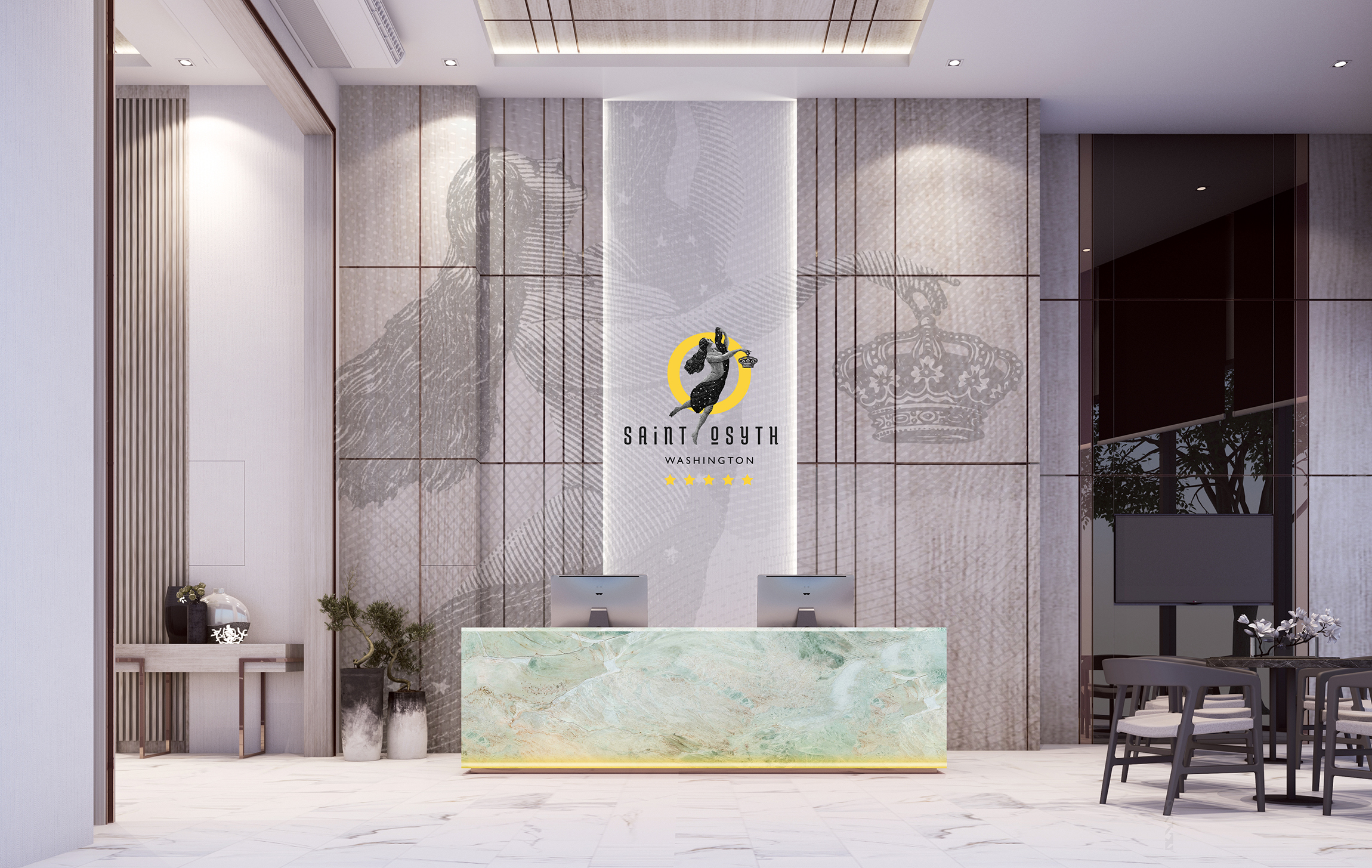
I was asked to conceptualise the branding for a 5-star hotel called Saint Osyth, plus its street-facing delicatessen and flagship restaurant, both affectionately called Saint O.
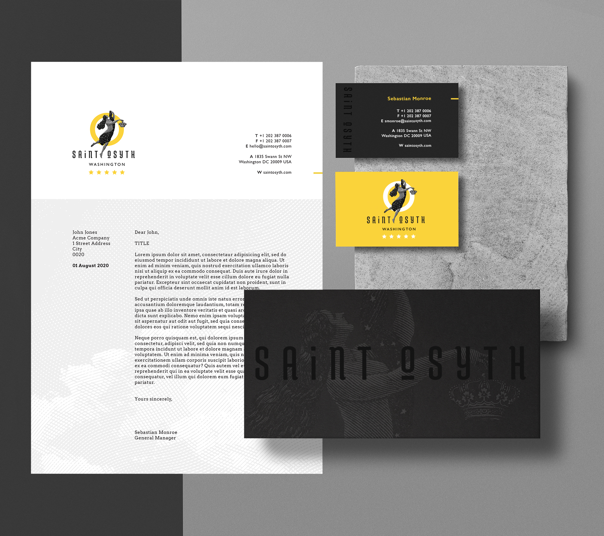
The brief included the design of logos for the different entities, branding in the public areas, a full suite of stationery, wall coverings, art, and product packaging.
The solution →
I started out by researching who Saint Osyth was. It transpires that she was an 8th Century English saint who was born of a noble family and married the King of Essex before founding a convent and ruling as its first abbess.
With this knowledge, I set about designing the hotel’s logo. I wanted to include an actual representation of Osyth, this spirited, strong and opinionated queen who became a martyr and legend-maker. I wanted her to be weightless, free and triumphant. She holds a crown in her hand gingerly, representing the fact that she did not seek the royal life and that her life’s interests lay elsewhere.
The engraving style of the illustration is timeless and traditional, but the yellow circle modernises the look. It not only represents the O in Osyth, but is also an abstract halo.
I manually tweaked an existing typeface to create a relevant, exciting and unique font which appears across the various brand touchpoints.


I carried the engraved look – emulating woodcut and metalcut prints – across various illustrations that appear on the stationery and wallpaper designs. They are monotone and subtle, creating visual interest without being distracting.
Brighter artworks were conceptualised for the walls of the bedrooms and suites, each of them featuring a yellow arc to help subtly bring the hotel’s identity into the individual spaces.
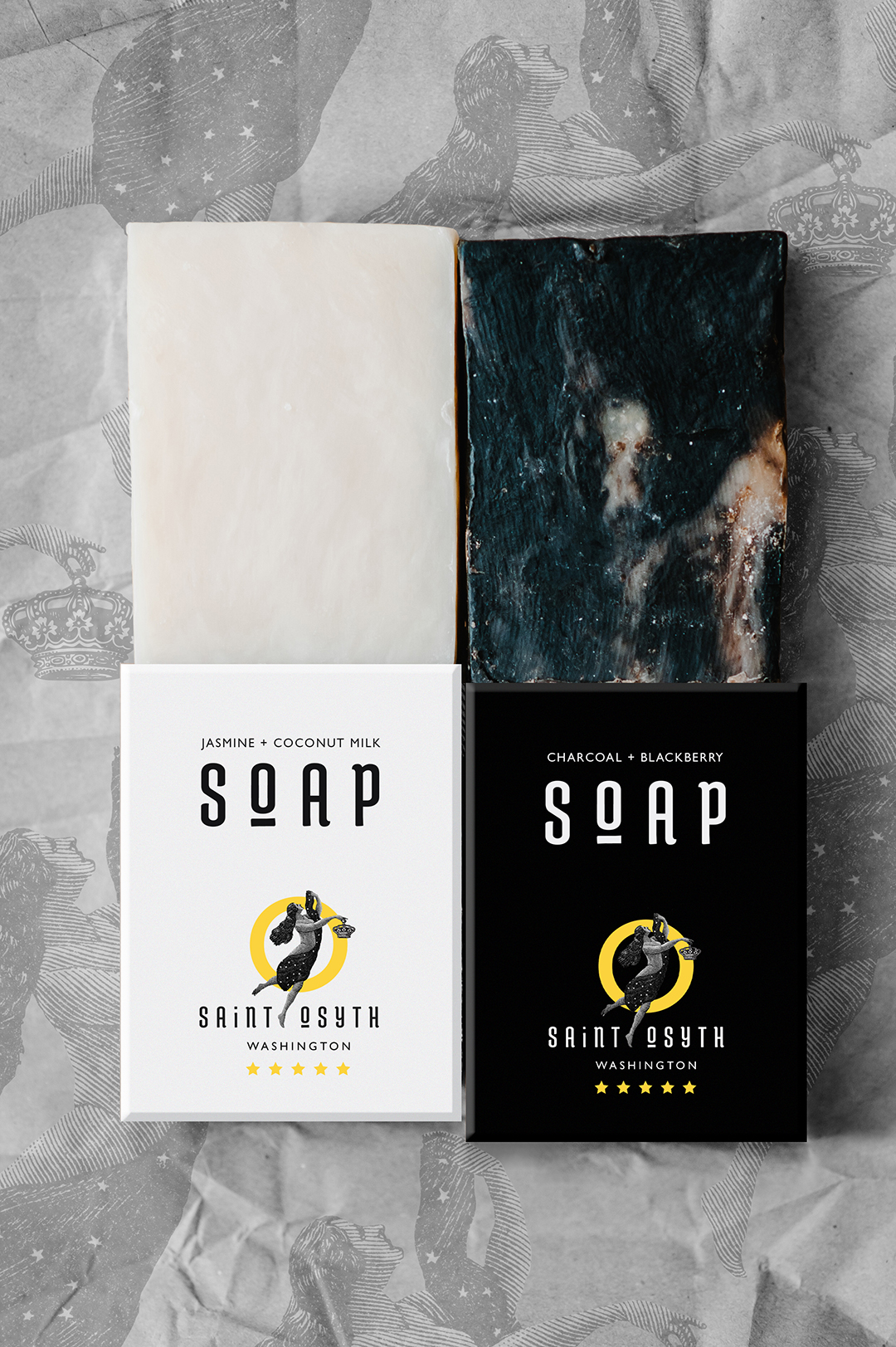

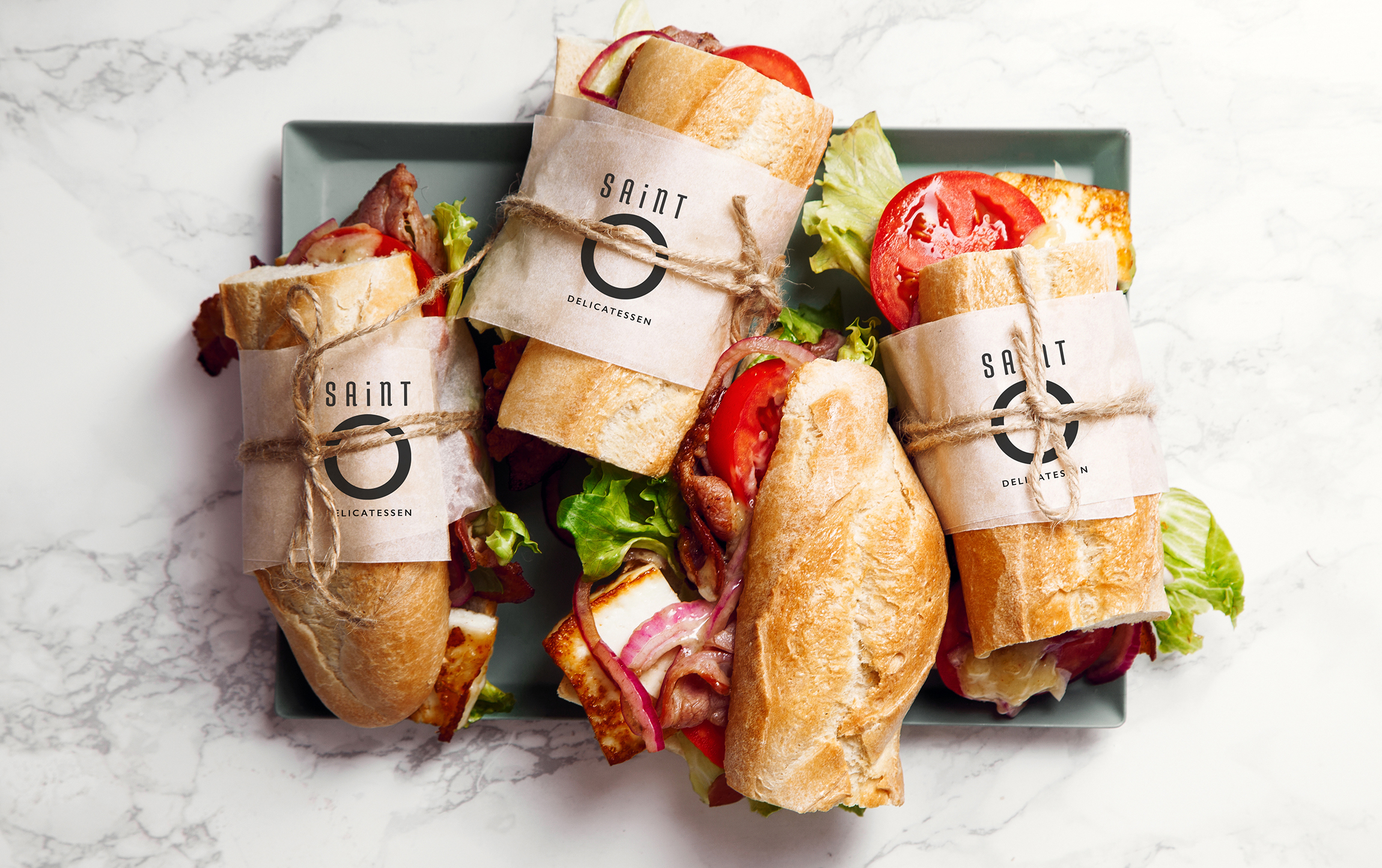
Packaging designs for the hotel and deli’s signature products include boxes and bottles for toiletries, numerous on-shelf packaged items for sale, and wrappings for fresh ingredients and on-demand meals.
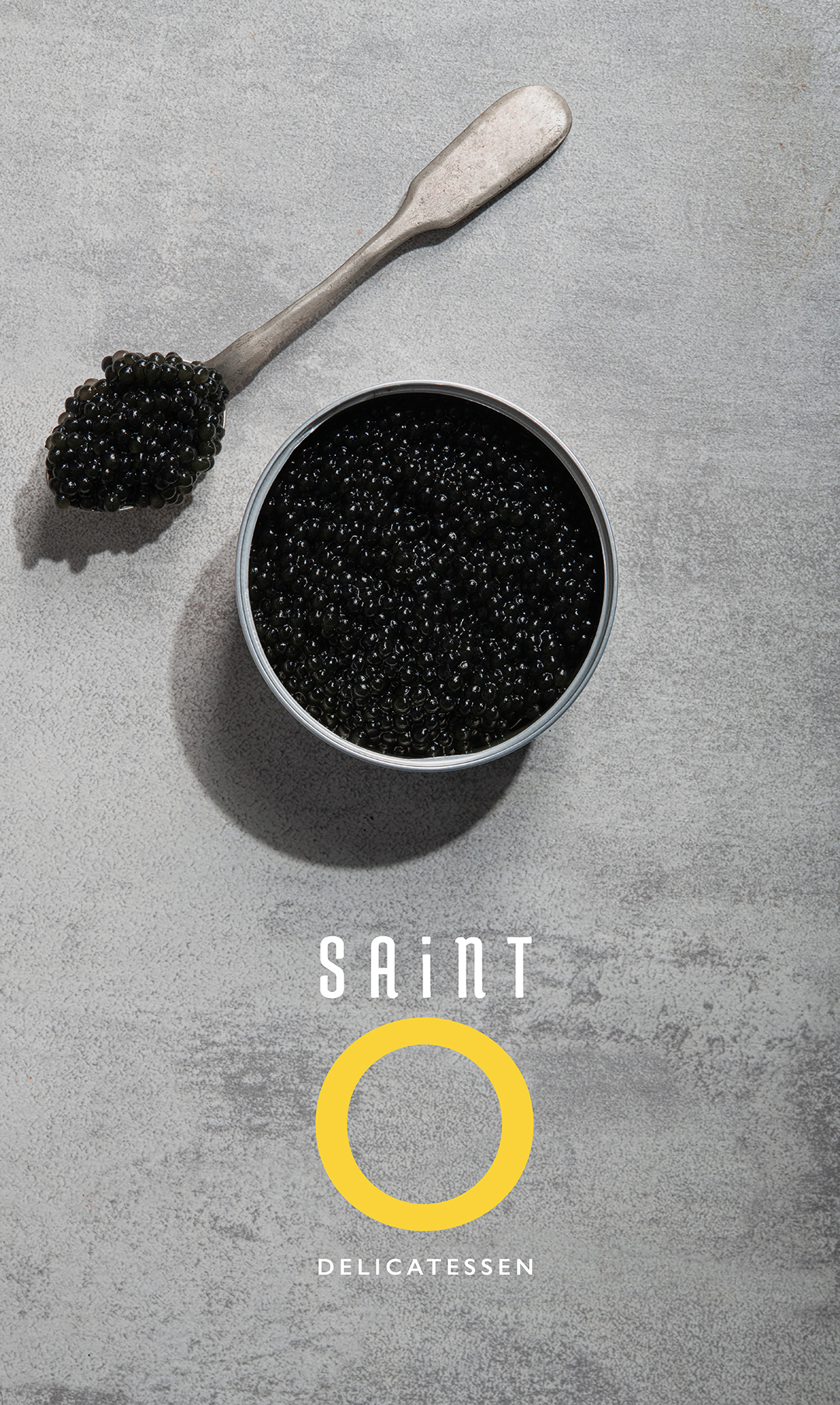
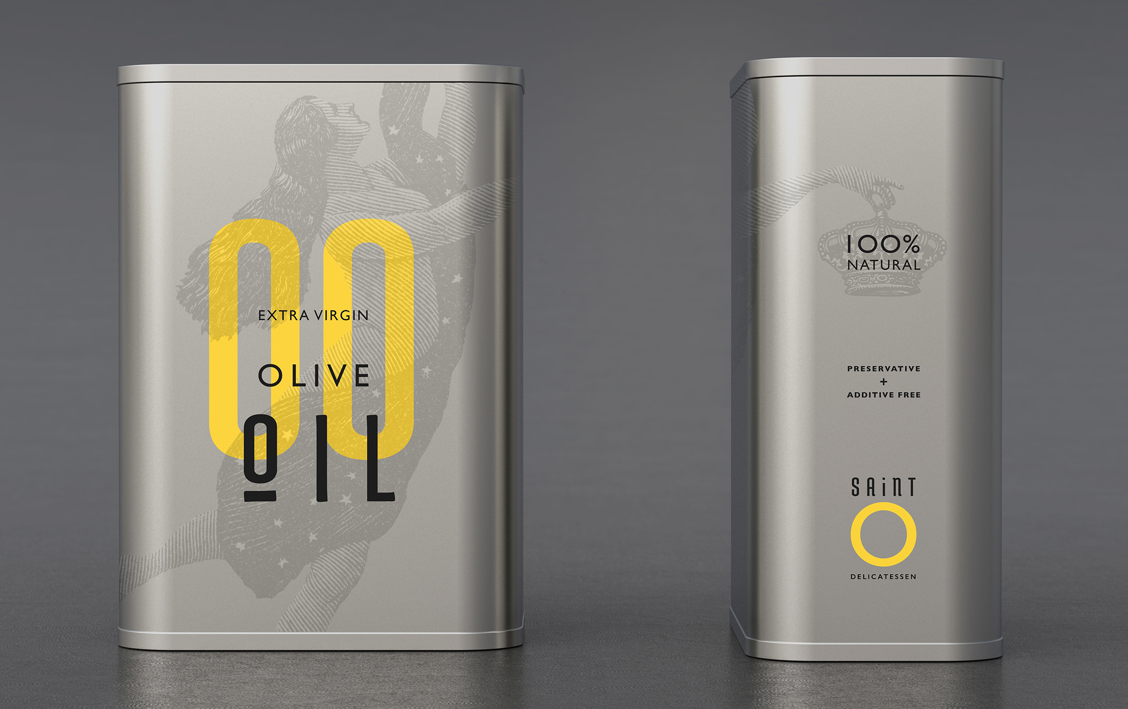
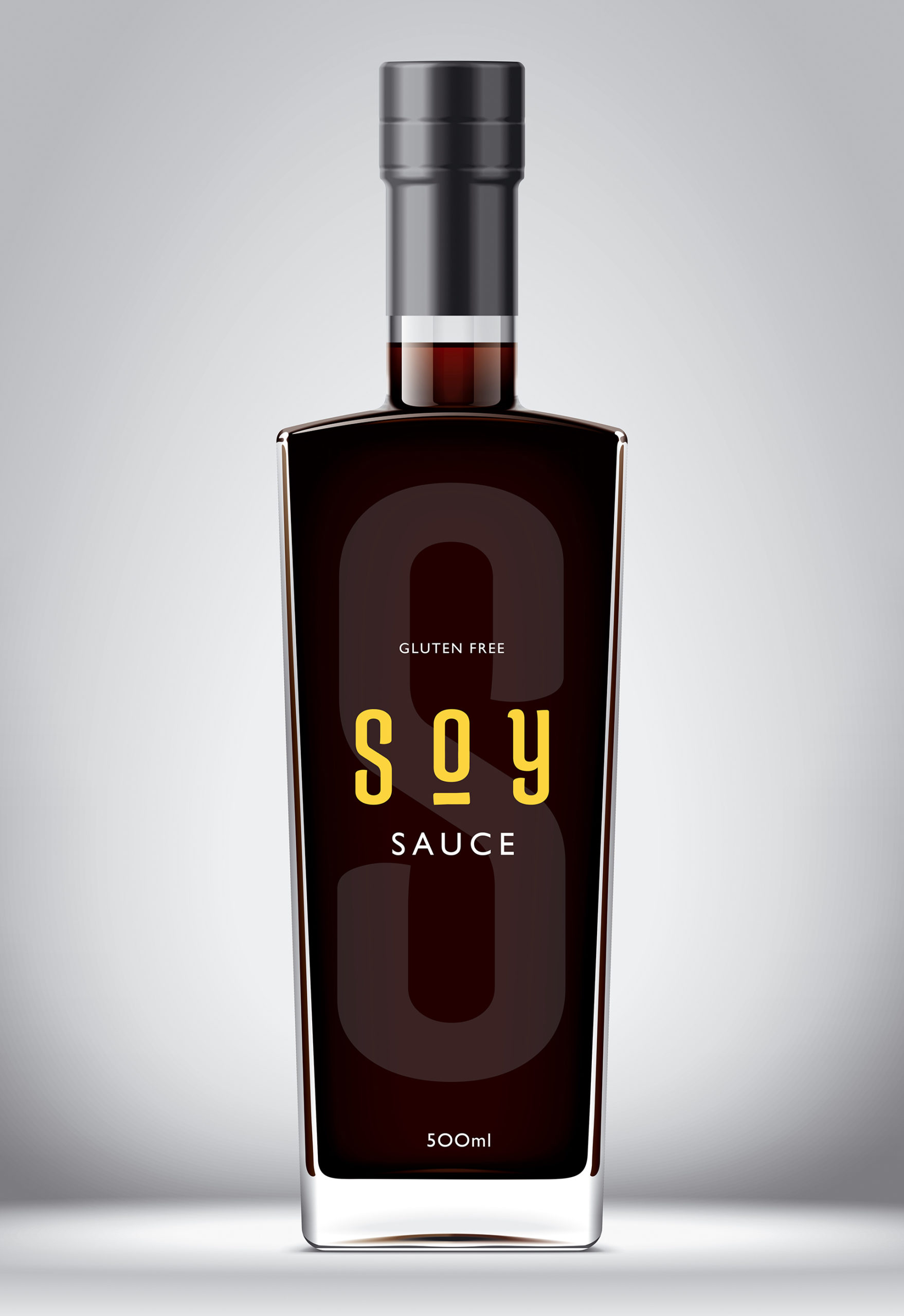
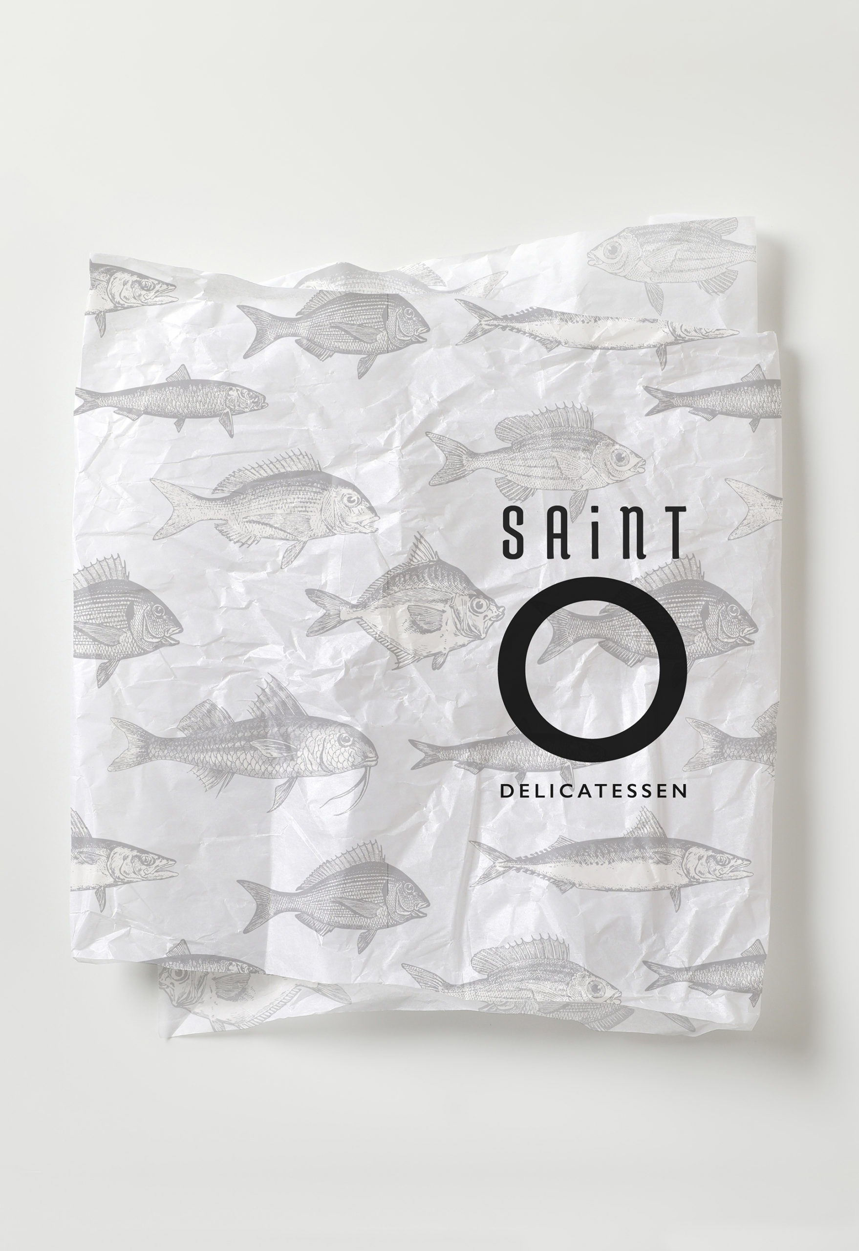
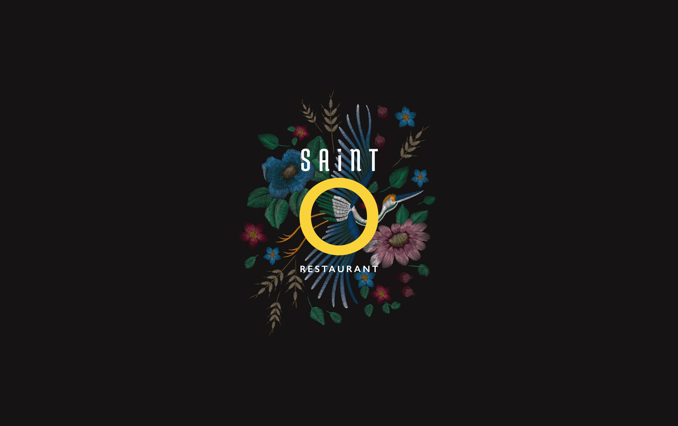
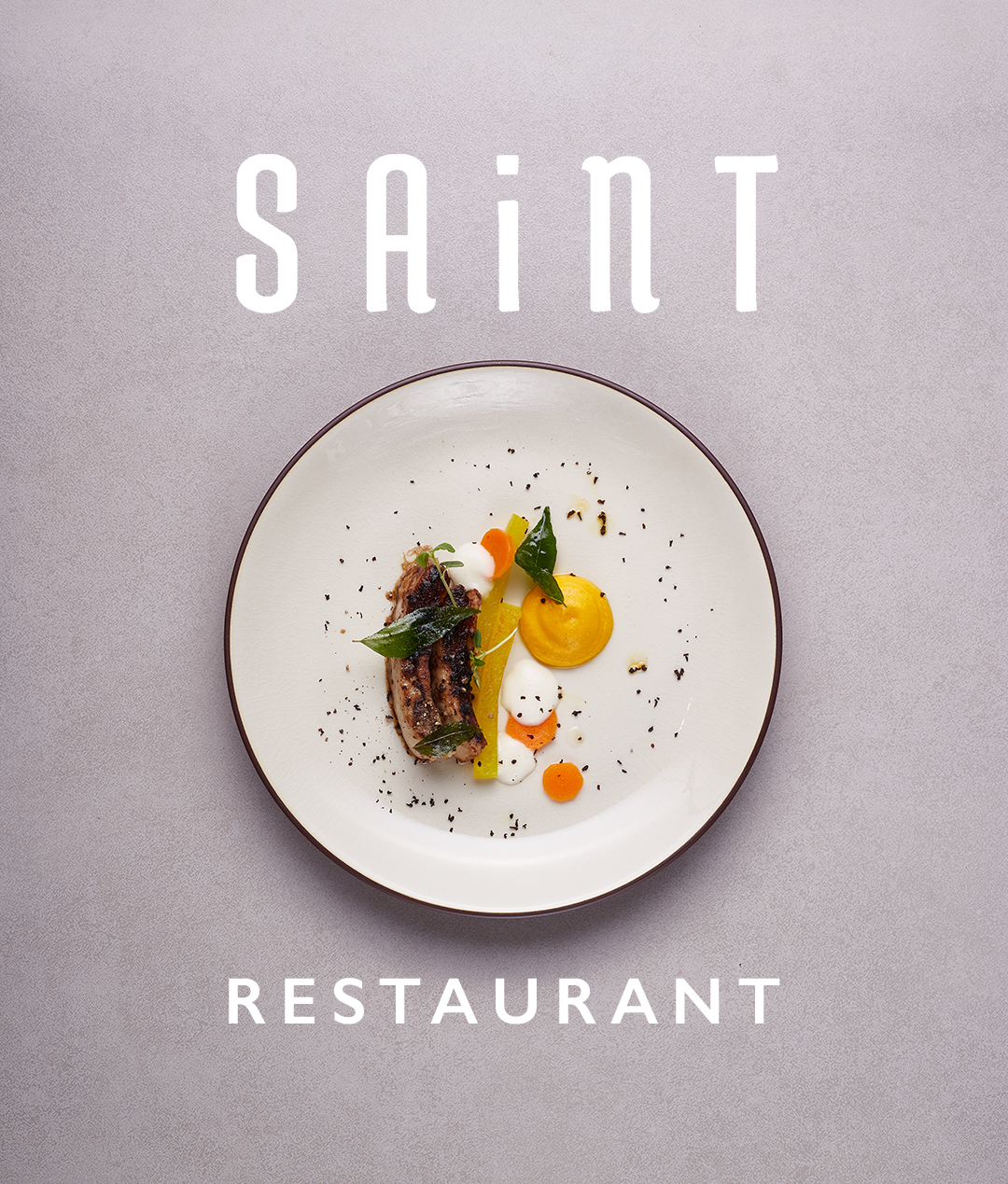
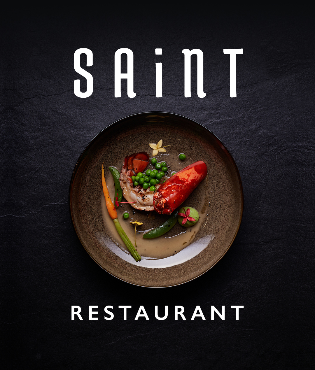
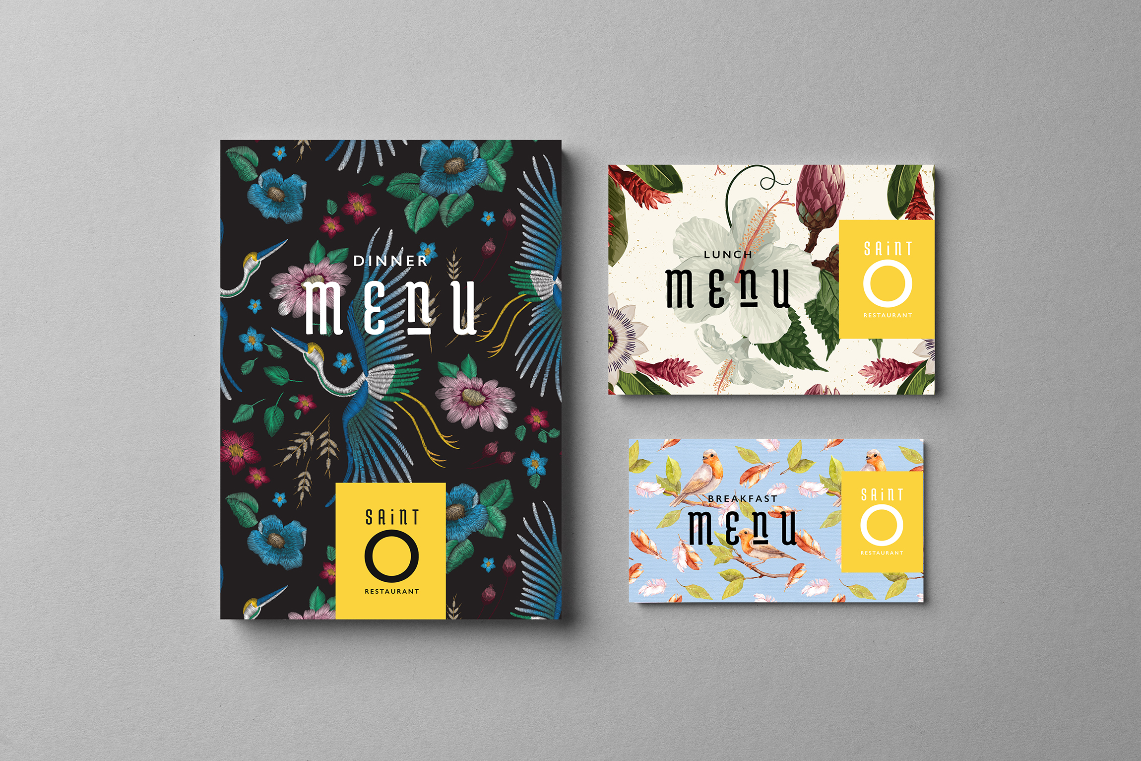
The restaurant’s design deliverables included a logo, wallpapers, billfolds, napkins and menus.

NEXT PROJECT
↓


JJUST MOVE
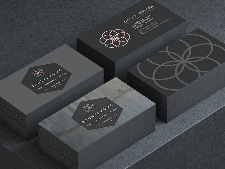
Logo design, stationery and website creation for an urban pilates, yoga and biokinetics studio in Johannesburg.
VIEW >

JJUST MOVE
Logo design, stationery and website creation for an urban pilates, yoga and biokinetics studio in Johannesburg.
VIEW >


JJUST MOVE
Logo design, stationery and website creation for an urban pilates, yoga and biokinetics studio in Johannesburg.
VIEW >
