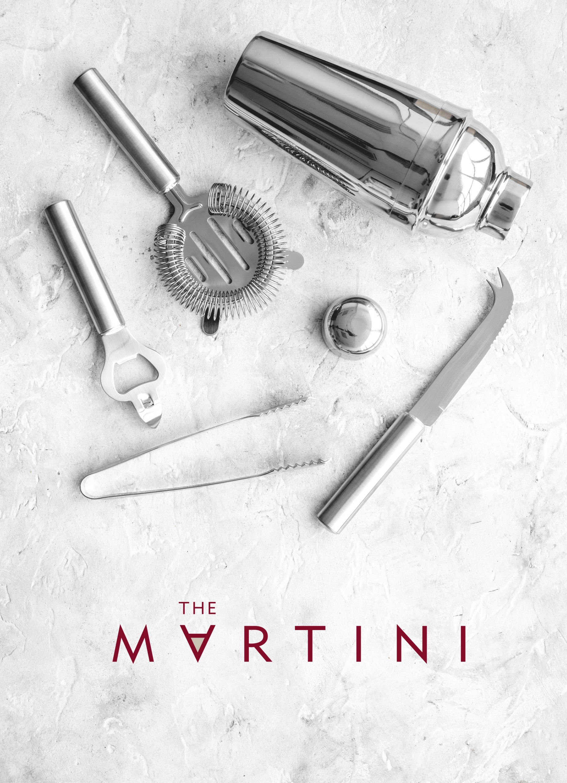
THE MARTINI
Branding for a five-star hotel’s cocktail bar in Cape Town.
The brief →
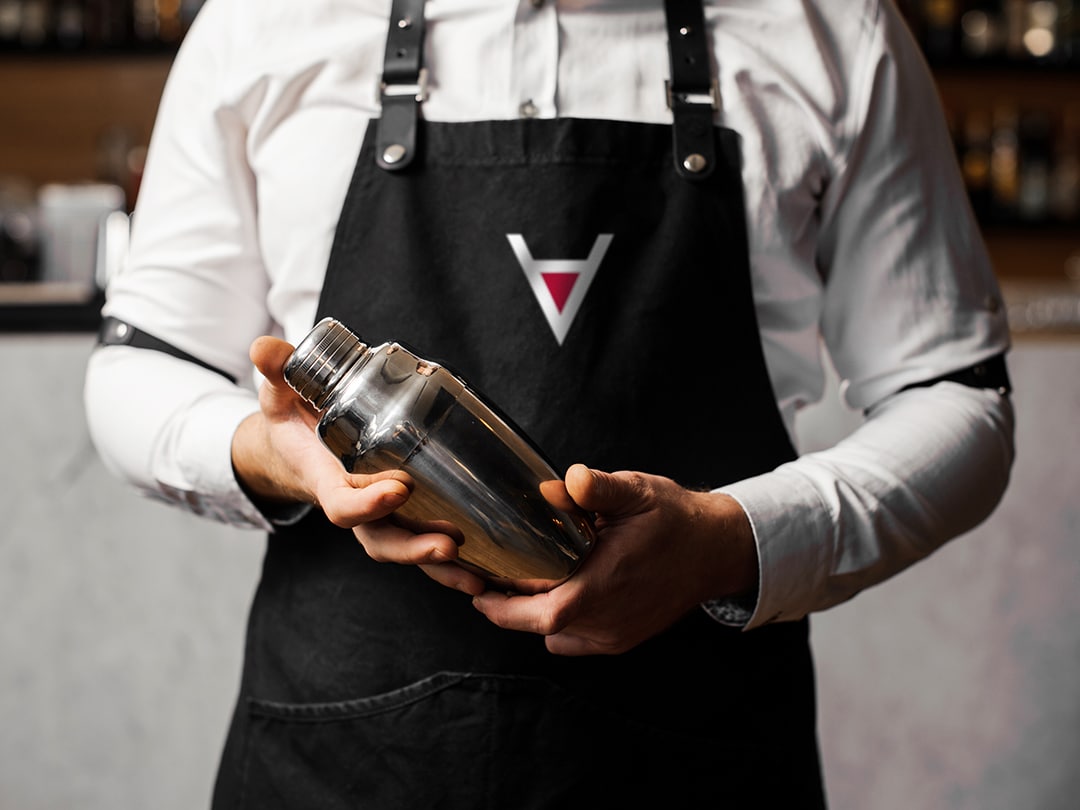
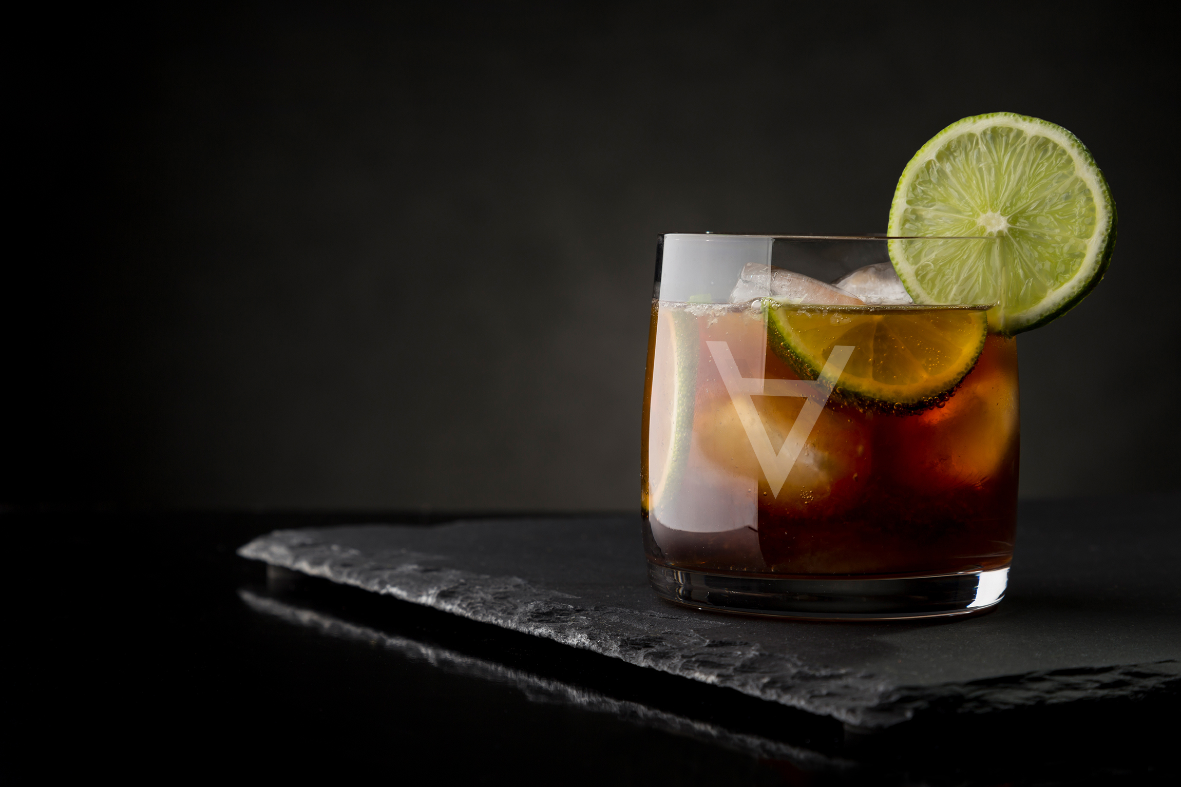
When the Cellars-Hohenort hotel revamped their signature bar, they needed a new logo that could be applied to signage, menus, napkins, coasters and drinking glasses.
The brief →
When the Cellars-Hohenort hotel revamped their signature bar, they needed a new logo that could be applied to signage, menus, napkins, coasters and drinking glasses.
The solution →
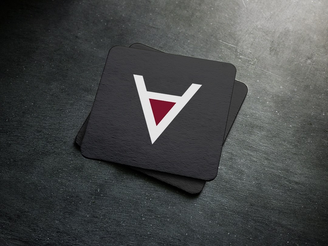
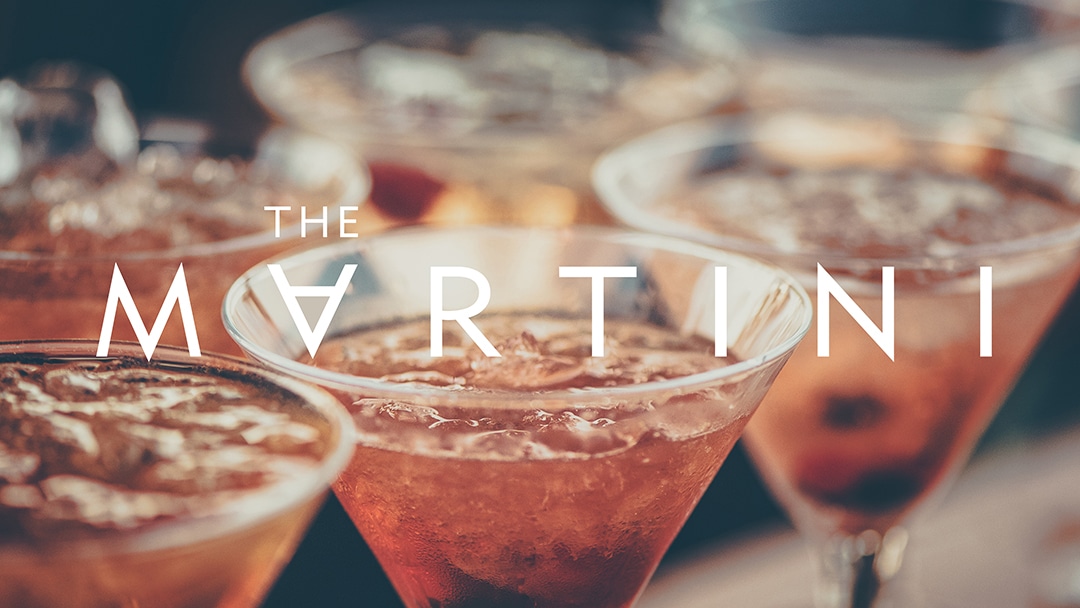
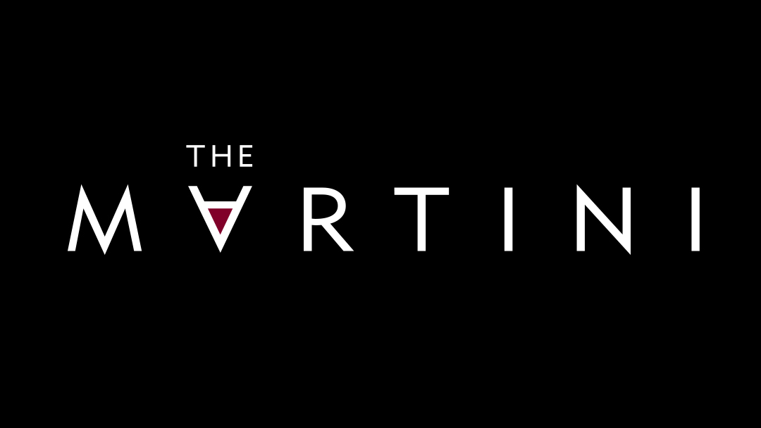
I wanted to create a look that would be contemporary, yet refined and classic to suit the five-star setting. Keeping wide kerning between the letters to give the logo a lot of breathing room, I flipped the ‘A’ over to create an abstract martini glass.
This inverted letter becomes the brand’s symbol, either nestled into the name or used as a standalone element depending on the application.
NEXT PROJECT
↓

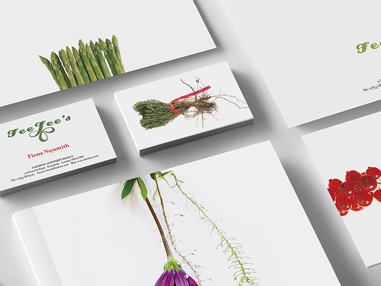
FEEFEE’S
Fresh and stylish corporate identity for a new catering company in England.
VIEW >

FEEFEE’S
Fresh and stylish corporate identity for a new catering company in England.
VIEW >


FEEFEE’S
Fresh and stylish corporate identity for a new catering company in England.
VIEW >
