WILSON’S ATTORNEYS
Personality-driven branding and website for a dynamic new law practice in Johannesburg.

The brief →
Hannah Wilson is a young, brilliant and vivacious estate lawyer who needed a logo, corporate identity and website when she started her new company.
Her brief to me was that she wanted something that matched her personality and would stand out against the traditional law firm look and feel. Although fresh and contemporary, however, it would still need weight and substance.
The solution →
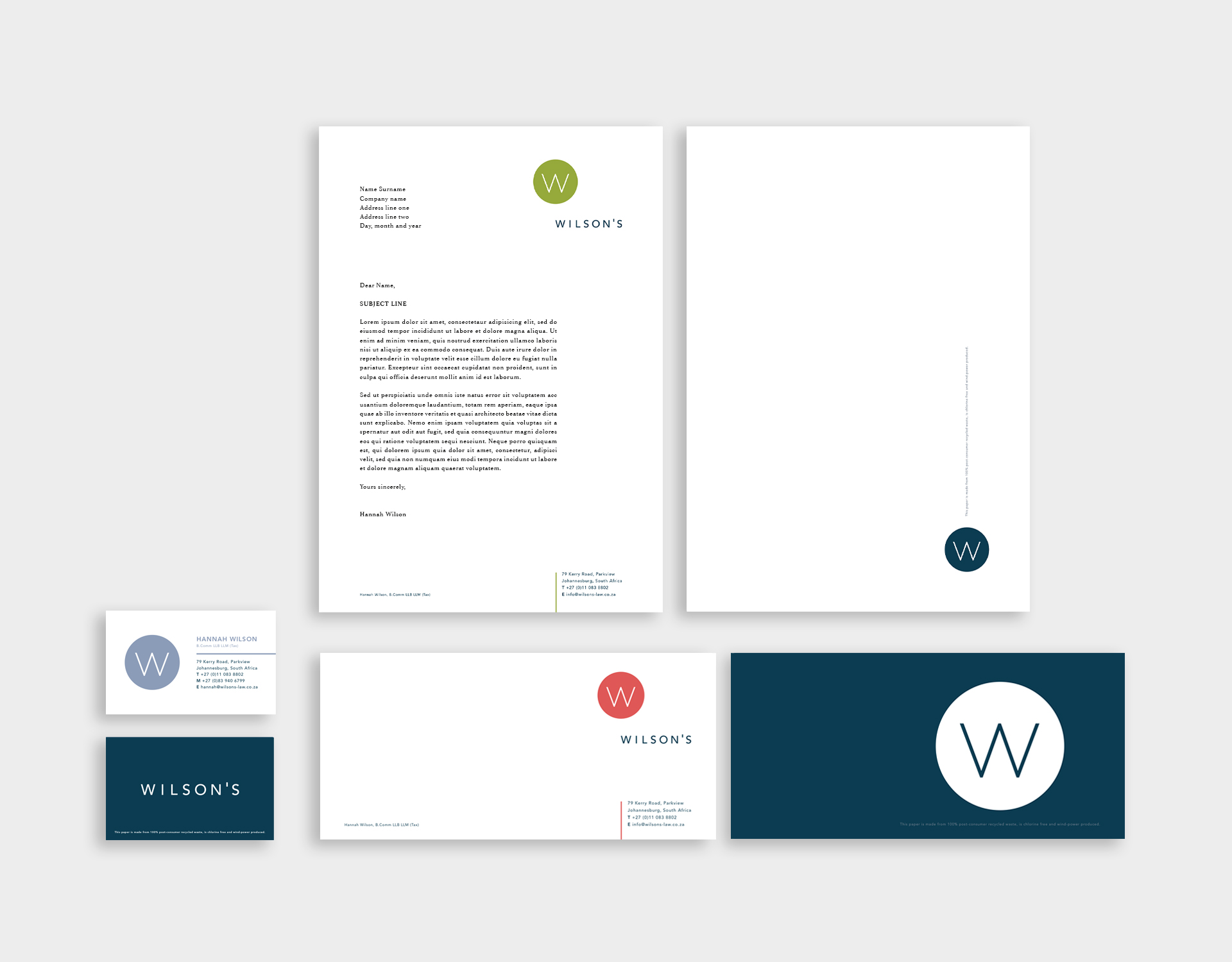
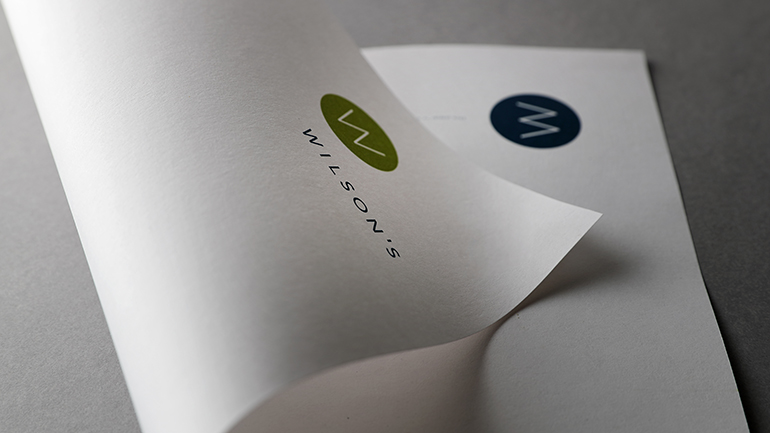
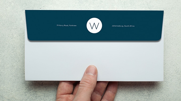
I knew immediately that I needed to stay away from over-used law iconography and serifed initials. So I created a very simple symbol made up of a W in a circle which appears in four different colours, each used separately on various branding elements.
A dark blue forms the base colour which holds everything together, and which tones down the overall look of the brighter colours to stop them from making the whole identity too one-dimensional and frivolous.
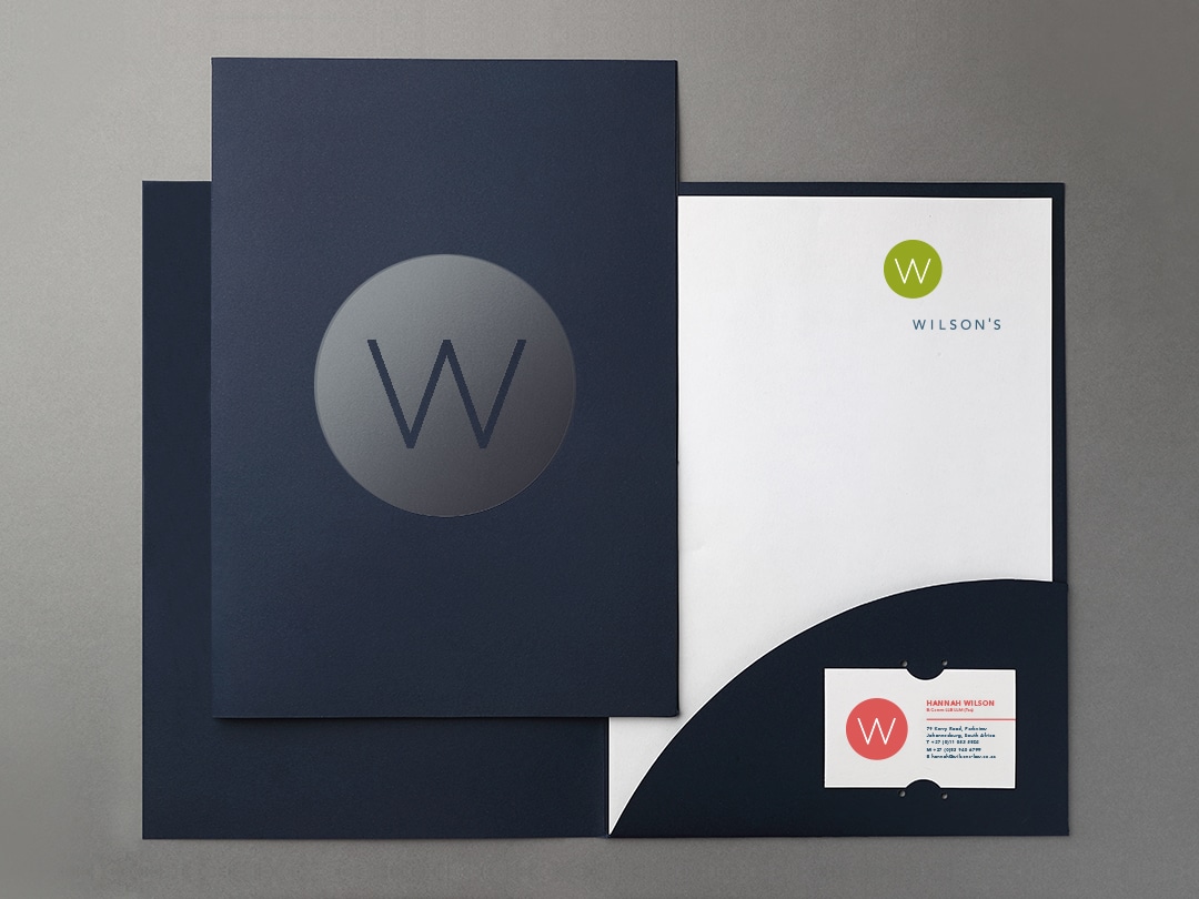
Subtle varnishing and various high-end textured paper stocks for the stationery elements further elevate the look.
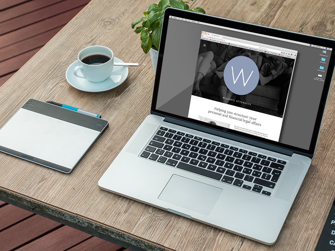
Completed elements include letterheads, comp slips, business cards, folders, envelopes, wallpaper and a website. You can view the website here.
#DC5857
#DBB5B8
#8A9BB7
#043D51
#95A721
When I decided to set up shop on my own, I approached Russ to assist me. All I was really clear on was that I didn’t want anything that looked like any other legal firm out there. Russ guided me through the process of developing a brand and managed to create a “look and feel” that I believe is consistent with how I want to show up in the world generally – both in what I do and how I do it: modern, sharp, clear, simple and straightforward. And a bit unconventional.
With regard to our stationery: I am delighted with the way in which Russ has successfully combined a respect for the gracious old-school tradition of quality stationery, with a modern edge in design and a commitment to social responsibility through the use of quality recycled paper.
With regard to our website: Russ has managed to deliver a modern, user-friendly, interactive interface that defies the “standard Lawyers’ Website” stereotype. (Which is exactly what I asked him to do – I specifically wanted a website that demonstrated that lawyers don’t have to be stuffy and long-winded and dusty and dull). In developing the website, Russ took time and endless trouble with the layout, page design, choice of pictures and language, with the result that the final product accurately captures the essence of who I am and how I do it. I couldn’t me more delighted.
I have so enjoyed working with Russ. In all my dealings with him over the years, he has been the model professional: reliable, patient and customer-orientated. It is always a pleasure working with him. I recommend him unreservedly.
NEXT PROJECT
↓


FACEBOOK PHOTO SHOOTS
Art directing various shoots for Facebook in developing markets around the world.
VIEW >

FACEBOOK PHOTO SHOOTS
Art directing various shoots for Facebook in developing markets around the world.
VIEW >


FACEBOOK PHOTO SHOOTS
Art directing various shoots for Facebook in developing markets around the world.
VIEW >

